How will President Obama respond this year to Chairman Ryan’s lower deficits and debt?
House Budget Committee Chairman Paul Ryan’s newly released budget poses an identical strategic challenge to the President as last year. I recommend you watch the President carefully this week to see whether and how he responds.
This is the third in a three part post.
- President Obama’s proposed medium-term deficits
- The Ryan budget proposes lower deficits, less debt than the Obama budget.
- (this post)
I’ll begin with the conclusion from the second post.
Conclusion: Over each year of the next decade the Ryan budget would result in lower deficits, less debt, and a better long-term debt trend than the President’s budget.
Key strategic point: Last year President Obama’s fiscal strategy was to claim to match Republicans on deficit and debt reduction, then point out that he did so in a way that he claimed better fit the priorities of most Americans. The difference, the President wanted to claim, was not in deficits or debt, but in how he and the Republicans reached the same end goal. His budget, the President argued, was both fiscally responsible and more compassionate because he raised taxes rather than cut spending deeply.
Rewind one year
Early last February the President proposed a budget. About two months later Chairman Ryan proposed a budget that would have resulted in significantly lower deficits and less debt than the President’s proposal. This undermined the President’s public strategy, so a week later the President counter-offered. He released a new budget proposal that he claimed matched the Ryan budget on deficits and debt.
While the President did put more spending cuts and tax increases on the table in his second proposal, he did not actually match the deficits in the Ryan budget. He couldn’t or wouldn’t make enough hard choices so he (a) relied on an ambiguously defined automatic trigger to justify some of his deficit reduction claims and (b) used a longer timeframe to measure his proposal than Ryan’s. The Ryan budget proposed $4 trillion of deficit reduction over 10 years. The President said his new proposal reached the same $4 trillion in 12 years, hoping that no one would notice that this meant he was proposing $2.8 trillion of deficit cuts over 10 years (and even that number is a generous interpretation). By showing you results rather than changes from a baseline I hope that my graphs will make a repeat of any such tricks more transparent this year.
Setting aside the holes and timing gimmicks in the President’s second budget proposal last year, the strategic move stands. When it became obvious that the House Republican budget would result in significantly lower deficits and less debt than the President’s budget, President Obama proposed a second budget.
All this happened well before the grand bargain negotiations with Speaker Boehner, the debt limit showdown that resulted in the Budget Control Act, and the failed Super Committee negotiations. The challenge the President faces today is identical to the one he faced a year ago, but there has been a lot of intervening action that might provoke a new Presidential strategy this year.
Same challenge. Same solution?
Today President Obama faces the same strategic challenge he did last year at this time. The President has two options.
<
ul>
The President and his team are smart enough that they should have seen this coming. I wonder how they will answer the deficit/debt comparison question today? Has the President made this strategic choice yet?
The Ryan budget proposes lower deficits and less debt than the Obama budget
House Budget Committee Chairman Paul Ryan released his budget today. Let’s compare Chairman Ryan’s proposed medium-term deficits and debt with the President’s.
This is the second in a three part post.
- President Obama’s proposed medium-term deficits
- (this post)
- How will President Obama respond this year to Chairman Ryan’s lower deficits and debt?
If you have not done so already I recommend you first read yesterday’s post on the President’s proposed deficits. You will see why I am focusing on displaying proposed results rather than proposed changes. I hope that today’s post drives home my point about the benefits of apples-to-apples comparisons of results without the distraction of the baseline/increase/decrease squabbling.
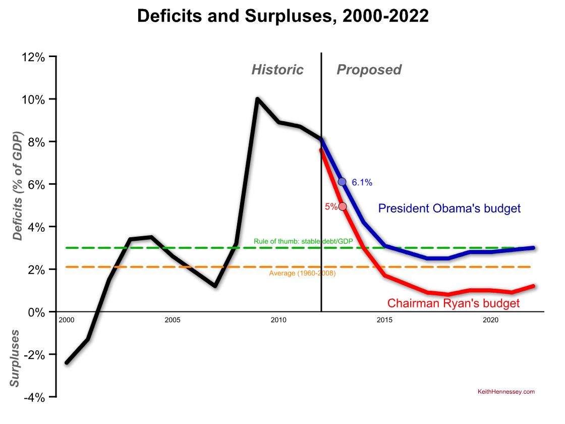
Here is yesterday’s deficit graph with a new line added in red for the Ryan budget.
I won’t repeat yesterday’s explanation of the chart, which includes explanations of the green and orange lines. The historic line is now black. Now we can compare the President’s budget in blue to the Ryan budget in red. As always, everything is measured relative to the economy (% of GDP).
This chart makes the deficit comparison easy:
- The Ryan budget proposes a 5% deficit for FY13, lower than the President’s proposed 6.1% deficit for that same year.
- Chairman Ryan’s proposed deficits are lower than the President’s proposed deficits in each year of the next ten. The gap widens over time to a maximum of two percentage points in 2021.
- The Ryan deficits would drop below the 2.1% historic average in 2015 and would remain significantly below the average through the rest of the 10 year budget window. The President’s budget is above the average in each year of the next 10.
- At the end of the decade Chairman Ryan proposes a 1.2% deficit compared to the President’s proposed 3.0%.
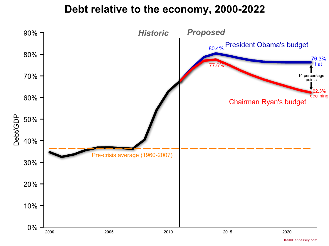
We can do the same thing with debt.
Again by focusing on results rather than changes relative to a disputed baseline, the comparison is quite easy:
- Under the Ryan budget debt would peak at 77.6% of the economy in 2014. Under the President’s budget debt would peak at 80.4% of the economy in that same year.
- The Ryan budget would cause debt to steadily decline to 62.3% of GDP by the end of the decade. Under the Obama budget debt would flatten out by 2018 and end the decade at 76.3% of GDP, 14 percentage points higher than under the Ryan budget.
- At the end of 10 years debt would be declining relative to the economy under the Ryan budget, while it would be flat under the President’s budget.
- For comparison the pre-crisis (1960-2007) average debt/GDP was 36.3%.
Conclusion: Over each year of the next decade the Ryan budget would result in lower deficits, less debt, and a better long-term debt trend than the President’s budget.
This deficit and debt comparison poses a strategic challenge to the President identical to one he faced last year. In a separate post I explain this challenge and the President’s options.
Eight month scoop?
Sunday’s Washington Post contains an excellent article: Obama’s evolution: Behind the failed ‘grand bargain’ on the debt. Congratulations to Peter Wallsten, Lori Montgomery, and Scott Wilson for this combination of analysis and tick tock reporting.
You can, if you like, compare it to something I posted at the time: Why the Obama-Boehner talks fell apart. I think this means I scooped the Post by about eight months.
I also wrote a contemporaneous post opposing the Gang of Six plan that received some attention at the time.
(photo credit: Franklin B Thompson)
President Obama’s proposed medium-term deficits
This is the first in a three part post.
- (this post)
- The Ryan budget proposes lower deficits and less debt than the Obama budget
- How will President Obama respond this year to Chairman Ryan’s lower deficits and debt?
The business of Washington, DC is changing policy. Almost everyone in Washington is trying either to change some element of policy or to prevent someone else’s changes.
As a result the public debate centers almost entirely on the fight over how and how much policy would change rather than on what the absolute results would be. Both are important, but public debate usually ignores the results and only argues about the proposed change. That’s bad.
In fiscal policy this often leads to endless debates in which both sides agree on what the result of a proposed policy would be, but disagree on whether that result is an increase or a decrease because of disagreements about the baseline, the starting point for measuring a change. It also leads to poorly informed decisions in which policymakers ignore whether the results are acceptable relative to an objective standard.
I care a lot about whether a proposal increases or reduces the deficit. I care a lot more about these changes, and about deficits in general, when the resulting deficits are 7-10 percent of GDP than when they are 1 or 2 percent.
I am therefore going to do something a bit unusual with today’s chart. I’m going to show you the deficits proposed by President Obama in his budget without telling you whether they are increases or reductions relative to some (easily disputed) future baseline. By doing this I hope to focus your attention on a different way of thinking about the deficit that may be more important than the way Washington traditionally looks at a budget. Instead we’re going to compare the President’s proposed deficits to two results standards that are difficult to gimmick.
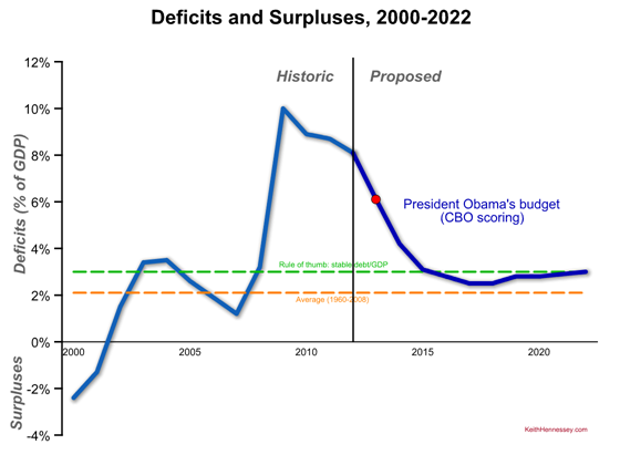
Here are deficits and surpluses since 2000 and President Obama’s proposed deficits for the next ten years. I’d like you to focus on (1) the shape of the the dark blue proposed line and (2) how it compares to the green and orange dotted lines. As always, click on the graph to see a larger version.
- This graph is measured in percent of GDP.
- Actual historic surpluses (in 2000 and 2001) and deficits are in medium blue. The President’s proposed deficits are in dark blue, to the right of the black vertical line.
- The red dot shows the most important proposed deficit, that for Fiscal Year 2013, the year Congress is now working on (in theory). This fiscal year begins October 1, 2012. The President proposes a 6.1% deficit for FY13. This year’s (FY12) deficit is projected to be 8.1% of GDP.
- The dotted orange line represents the average (pre-2008 crisis) budget deficit of 2.1% of GDP. That’s the average from 1960-2008.
- The dotted green line is at 3% of GDP, a rule-of-thumb line for the deficit/GDP that would result in debt/GDP staying constant. Deficits above the green line mean the debt is increasing relative to our economy, while deficits below the green line mean the economy is growing faster than government debt [held by the public].
I suggest you memorize three numbers when you’re discussing deficits: 0, 2, and 3.
- Zero is a balanced budget, of course.
- The historic (pre-crisis) average budget deficit is about 2% of GDP.
- A deficit of roughly 3% of GDP will hold debt/GDP stable.
(Technically the 2 is between 1.8 and 2.1, depending on exactly when you start the window. For a rule of thumb, two works great.)
Key #1 to understanding the President’s budget is that he would bring the deficit down below the green line and then make sure he doesn’t break above it again. I’d bet heavily that’s the principle his budget director used in building this budget – get me to a point where we are (just barely) not increasing debt/GDP, at least at the end of the 10-year budget window.
Key #2 is that at no point in the next ten years would his deficits be at or below their historic average. The proposed blue line is at all times above the orange line.
This is consistent with where the President has been on the deficit since his “second” budget proposal last spring. If Congress does what the President proposes, the debt/GDP situation will briefly stop getting worse for a few years at the end of the next decade before entitlement spending pressures once again start driving deficits up.
It also means that the President would not, for a single year, get deficits below their historic average. Rather than fluctuating around 2% of GDP as it has since 1960, the President proposes a new medium-term deficit ceiling of 3% of GDP.
Conclusion: The President’s budget would result in deficits that are always higher than the historic average but would, beginning six years from now, temporarily stop government debt from increasing relative to the U.S. economy.
Why is American oil production up?
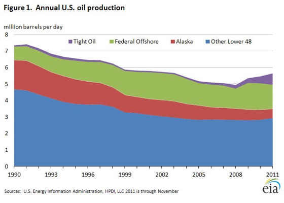
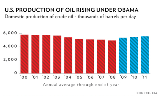
Correction: Silly me, I assumed that shale oil and oil shale were the same thing. They are not. The technology improvements in fracking refer to shale oil, which is different than oil shale. I have modified the post below to use the unambiguous and clearer term Here is President Obama, speaking about energy yesterday in Maryland: First of all, we are drilling. Under my administration, America is producing more oil today than at any time in the last eight years. (Applause.) Any time. That’s a fact. That’s a fact. We’ve quadrupled the number of operating oil rigs to a record high. I want everybody to listen to that — we have more oil rigs operating now than ever. That’s a fact. The President is right – oil production has climbed steadily and significantly since 2007. This helpful graph from the Energy Information Administration shows us why. The surge comes almost entirely from a big increase in the production of light tight oil EIA projects this positive trend in tight oil production will continue: Production from tight oil plays is expected to continue climbing. High oil prices make tight oil development profitable in spite of the higher costs associated with the advanced production methods being used. The two big tight oil plays are known as the Bakken formation in North Dakota and Montana and the Eagle Ford in south Texas. According to EIA these two accounted for 84 percent of tight oil production in November 2011. Bakken is bigger than Eagle Ford but Eagle Ford’s production is growing more rapidly. The President’s rig count statement is also true, and for the same reason. Oil rigs have surged in the past few years, again to produce light tight oil This increased oil production is not the result of policy decisions by the Obama Administration but instead the result of recent improvements in oil exploration technology, specifically the ability to extract light tight oil using fracking. Upon closer review it appears the Administration is well aware of this. All of the President’s remarks and supporting White House documents frame this domestic oil production increase about something that is occurring under the Obama Administration or during the Obama Administration. They are careful never to claim that these oil production increases are happening because of actions taken by the President or his Administration. The only case in which they exaggerate is this graph that they use quite often. The red vs. blue shading misleads you into concluding that a policy decision by President Obama resulted in an increase in U.S. oil production, while the graph title merely claims that production is rising “under Obama.” You can be sure that if it was “because of Obama” they would have said that. It’s also interesting that the Administration seems to be avoiding Domestic oil production in the U.S. has increased over the past three years and should continue doing so in the near future. That is good news. This good news results from improvements in oil production technology, not from President Obama’s policies., aka shale oil.from shale.
He would not dwell in blame
From the new Obama-Biden campaign video:
And when he faced his country, who looked to him for answers, he would not dwell in blame or dreamy idealism.
(photo credit: White House photo by Pete Souza)
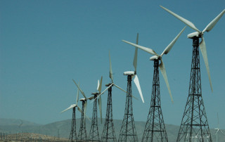
Nearly doubling renewable energy generation
Today the Administration released their Blueprint for a Secure Energy Future: One-Year Progress Report.
Almost every time President Obama talks about energy he mentions wind and solar power. He used to talk about nuclear power as well. Doing so was politically courageous for a Democrat because nuclear power splits the environmental left. The President rarely mentions nuclear power these days, I presume because of the Fukushima earthquake + nuclear incident a year ago.
The White House blog post accompanying the Blueprint includes the following highlight:
Doubling Renewable Energy Generation: Thanks in part to the Obama Administration’s investment in clean energy – the largest in American history – the United States has nearly doubled renewable energy generation from wind, solar, and geothermal sources since 2008.
“Nearly doubled” in less than four years sounds pretty good but reminds me of this Dilbert cartoon. In it Dilbert raises his hand and asks the marketing manager:
Are you asking a room full of engineers to be excited about a big percentage increase over a trivial base?
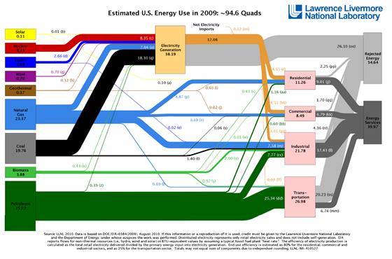
Let’s look at my favorite energy graph, produced by Lawrence Livermore National Laboratory, a part of the Department of Energy. It translates all energy usage into a common unit (BTUs) for comparison. You’ll probably want to click on the graph to see a larger (and readable) version. In particular look at the size of the solar (yellow), wind (purple), and geothermal (brown) connecting lines, especially in comparison to the lines for nuclear (red), coal (black), and natural gas (light blue).
Wind, solar, and geothermal sources are trivially small sources of U.S. energy. Doubling their usage is significant within those industries but when compared to the overall pattern of energy usage in the U.S., the increases are tiny.
Here are three basic facts to know about energy sources for electricity production in the U.S.:
- We have lots of really cheap coal.
- Thanks to new fracking technologies we now have lots of cheap natural gas, too.
- Nuclear comes in third and represents about 20% of our source of electricity production.
Don’t forget two points from yesterday’s post which you can see easily from the above graph:
- In America there is little overlap between fuel used for transportation and electricity used to light, heat, and power our homes and businesses.
- If you could make solar power price competitive with electricity produced from coal or natural gas you would do almost nothing to lower the price at the gas pump because there are so few electric-powered and hybrid vehicles on the road.
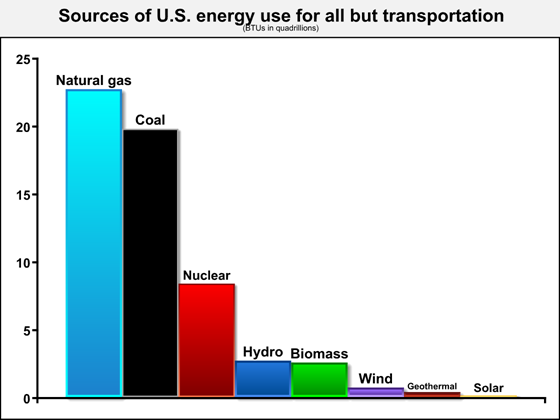
Let’s compare BTU totals in sources of U.S. energy excluding transportation.
From this graph you can see how small wind and solar power are relative to other energy sources in the U.S. Even large percentage increases in the use of solar and wind power will have trivial impacts on the patterns of American energy usage. Doubling, tripling, or quadrupling our usage of these technologies will not fundamentally change the three above basic facts about electricity production in the U.S. Until there is a technology breakthrough, the U.S. is a land of electricity production from coal, natural gas, and nuclear, with hydro and biomass trailing and with wind, geothermal, and solar too small to matter much at all.
The value of increased solar and wind production is not the marginal short-term reductions of coal and natural gas we use in America. These increments are too small to matter. The benefit is instead whatever we learn about producing and using these technologies that might, at some point in the future, result in innovations that so significantly reduce the cost of these technologies that it becomes less expensive to produce power from these renewable sources than it does with our abundant supplies of coal and natural gas. If the technology ever crosses (or even approaches) those breakeven thresholds, then these energy sources will rapidly and significantly alter the shape of the U.S. energy picture.
Until then the President has a rhetorical point that sounds good but matters little to how we use and produce energy in the U.S.
(photo credit: Nedra)
In America, power and fuel are separate issues
In his weekly address President Obama said:
But you and I both know that with only 2% of the world’s oil reserves, we can’t just drill our way to lower gas prices – not when consume 20 percent of the world’s oil. We need an all-of-the-above strategy that relies less on foreign oil and more on American-made energy – solar, wind, natural gas, biofuels, and more.
Solar, wind, and natural gas have almost nothing to do with the price of gasoline.
Policies that affect oil, gasoline, ethanol and biodiesel, hybrid vehicles, battery technology, and vehicle fuel efficiency can all directly and significantly affect the price of transportation fuel (although often quite gradually).
In America, there is little overlap between fuel used for transportation and electricity used to light, heat, and power our homes and businesses. If you could magically make solar power price competitive with electricity produced from coal or natural gas you would do almost nothing to lower the price at the gas pump because there are so few electric-powered and hybrid vehicles on the road.
Similarly, the development of massive shale (natural) gas resources in the U.S. will make electricity more affordable in the U.S. but will have almost no effect on the cost of our transportation fuel.
Yes, there are linkages. There are a few hybrid vehicles on the road, and some commercial vehicle fleets use natural gas as fuel. But these are vanishingly small when compared with the petroleum-based and bio-based fuels we put in our cars, trucks, boats, and planes.
Some American homes are heated with oil, so reducing the cost of electricity can gradually, over many years, shift home heating away from oil.
And in some countries where oil is used to produce electricity, reducing the cost of other types of power production can reduce their use of oil, which through the wonder of global oil markets can lower the price at an American gas station. But these effects are for now quite small.
These linkages mean that the President’s statement is qualitatively correct. But the effects are so small that the President is quantitatively misleading the listener when he suggests that expanded use of solar and wind power will lower gas prices.
If (when?) battery technology leaps forward to make hybrid or electric vehicles a significant share of the market, then electricity and its sources will begin to act as significant substitutes for gasoline and diesel fuel. At that point R&D to reduce the cost of solar power, wind power, nuclear power, hydropower, and natural gas power could start to affect the price at the pump enough for you to notice.
But until then fuel and electric power are for all practical purposes separate issues, and when an elected official’s response to high fuel prices is more research on or subsidies for some form of electric power production, he is either confused or misleading you.
(photo credit: Jonathan Dueck)
A good Jobs Day
The fewest numbers you need to know
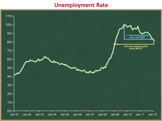
This morning the Bureau of Labor Statistics reported that in February the U.S. economy created 227,000 net new jobs and the unemployment rate held steady at 8.3%.
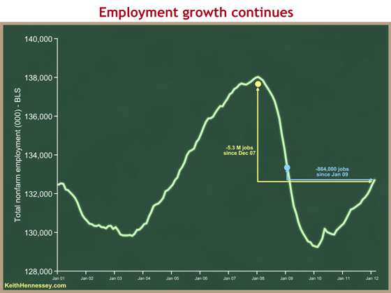
We are still 5.3 million jobs shy of peak employment in December 2007 and 864,000 shy of January 2009 when President Obama took office.
Same data, different views
Different audiences look at employment data in different ways:
- People’s lives are most affected by the level of employment: how many people are working and what is the unemployment rate? At 8.3 percent this number is still bad.
- As both a policy and political matter, Washington, DC cares about the level, but even more about the direction and rate of change: are we adding or subtracting jobs, is unemployment rising or falling, are we “headed in the right direction?” From this view today’s report offers good news, at least on the jobs created front. I assume the Administration will cite 17 months of continuous job growth. Possibly more significant is that we have had four months of job growth > 150,000/month, which is roughly what you need to keep up with population growth. The trend continues to be positive, although you should want even bigger numbers since the unemployment rate is still high.
- Markets and market commentators care even more about how the change compares with expectations before the data was released. Today’s numbers slightly exceeded expectations of about 200,000 net new jobs so the reaction from this perspective should also be positive.
Three data reminders
The unemployment rate does not include those who are discouraged and no longer seeking work. As hiring picks up you could see more of these discouraged workers starting to look for jobs. This could cause the measured unemployment rate to decline more slowly than if the number of people looking for work remained constant.
The +227K number is a net figure. It’s the difference between something like 4.2 million hires and 4 million separations last month. (We’ll know for sure when a different survey comes out soon.) Even when the net number is small or declining there is still a lot of hiring and firing going on.
Most economists measure full employment somewhere between 5 and 5.5%. I use 5.
Political impact
I imagine they are smiling in the Obama White House this morning. There are still downside risks like oil/gasoline, Israel/Iran, and ongoing European debt problems, but the underlying trend is upward and consistent, and downside risks are nothing new.
This positive trend highlights a question about the politics of the economy. Do voters make their judgment principally on the level of the economy or principally on the direction and rate of change? Republicans will stress the former: “Are you better off now than you were four years ago?” President Obama and his allies will stress the latter: “Things are getting better.” I am a bit surprised that I cannot find any political scientists who have studied which matters more to how people vote.
Even if the current positive trend were to accelerate I would anticipate economic policy to be a (the?) central focus of the election.
- The political economic debate has already started to shift to gas prices.
- If the economy looks good, debate will shift to the fiscal picture which is still miserable.
- The parties will debate whether the recovery is because of Democratic policies or in spite of them.
Everybody loves pictures
The Administration is using their standard graph to make their case.
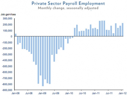
While I think they should be showing all employment rather than just private sector employment, the good news is the string of columns above the 0 axis. As expected, this graph focuses on the direction and rate of change of employment, the view the Obama White House wants to emphasize:
- the direction is positive when the columns are above the 0 axis;
- the height of the columns represents the rate of change – higher above the 0 axis is better;
- when the columns exceed about 150K the rate of change is big enough to keep up with population growth.
It is also important to understand what is going on with the level of employment as shown in the following graph. I think this graph better shows both the good news on the trend (upward slope since Jan 10) and the bad news on the level (yellow and blue arrows).
Finally, the unemployment rate graph tells a similar story. Unemployment is still quite high but is declining.
The President’s Buffett Rule is vaporware
va·por·ware (n): computer slang a product, especially software, that is promoted or marketed while it is still in development and that may never be produced
The President’s Buffett Rule is vaporware.
Here is the President speaking yesterday:
Congress needs to make the Buffett Rule a reality. This is common sense. (Applause.) If you make more than a million dollars a year — make more than a million dollars a year — you should pay a tax rate of at least 30 percent. (Applause.) And if you do that, that means that if you make less than $250,000 a year, like 98 percent of Americans do, you shouldn’t see your taxes go up. And we won’t be adding to the deficit.
These are things we can do today. It shouldn’t be that difficult. Now, whenever Congress refuses to act, Joe and I, we’re going to act. (Applause.)
The President has not actually proposed a tax policy that fits this principle. Neither his budget nor the tax proposals released by Treasury include any policy specifics to establish a new minimum 30% tax rate for those with income > $1M.
Treasury released 200 pages of proposed tax policy changes, including obscure things like repealing the preferential dividend rule for Real Estate Investment Trusts. They did not release specifics to accompany the one tax policy change the President talks about almost every day (and twice yesterday).
It’s OK to call on Congress to enact a policy that you describe only through broad-based principles. But when you do this you cannot also claim “We won’t be adding to the deficit.” The only way you can legitimately make such a claim is if you offer a specific proposal to back it up.
When you call on Congress to enact a policy that you describe only as a principle, you generally send Treasury officials to engage with the chairs of the tax writing committees to help draft legislation. Other than the President’s public comments I can find no evidence that the Administration is actually trying to get Congress to enact the Buffett Rule in legislation. The logical explanation is that President Obama wants Congress not to act so that he has a rhetorical weapon to use against Republicans in an election year.
Administration officials appear to be describing a policy that would replace the Alternative Minimum Tax, yet their budget also contains no proposal to repeal or replace the AMT.
And yet the President is calling on Congress to enact his vaporware proposal today.
Or is he? Here is White House Press Secretary Jay Carney responding to questions yesterday:
Q: I just wanted to ask you also about something the President said today. In the payroll tax cut extension context, he was pressing Congress to take action on other matters and said that Congress needs to make the Buffett Rule a reality. And the way he framed it seemed to suggest that this is something before Congress right now like the small business tax cuts and so forth. But the White House isn’t actually asking for the Buffett Rule to be put into law right now, is it? I mean, that’s a principle for tax reform. Are you asking them to act now?
MR. CARNEY: Well, it is a principle for overall individual tax reform. He is calling on Congress to make it a reality within the context of tax reform. The overall principle should be adhered to as we look at issues of the balance we have in our tax code going forward. We have a — as you know, the Bush tax cuts expire at the end of the year. This President believes that, short of overall tax reform, that the middle-income tax cuts need to be extended, made permanent. That’s long been his position.
He’s opposed to the extension again of the higher-income tax cuts, which we simply cannot afford. And the President’ overall approach to this is informed in part by the Buffett principle, by the Buffett Rule, that millionaires and billionaires should not be paying a lower effective tax rate than hardworking, average folks out there.
Q But he’s not asking Congress to turn that into a law right now, is he?
MR. CARNEY: Well, I think if you — it depends on how — what Congress’ approach is to issues of the tax code this year. If they address income tax, individual income tax, then they ought to ensure that the Buffett Rule is made law, if you will, through that practice — through that legislation.
Which is it? “These are things that Congress should do today,” or “It depends on what Congress’ approach is to issues of the tax code this year?” Both cannot be true.
The President is promoting and marketing a Buffett Rule policy that he may never produce and that it appears he may not really want Congress to enact. That’s vaporware.
(photo credit: White House photo by Pete Souza)
