Now that we have reviewed how big a bite the government has taken out of the economy over time, let’s examine the competing tax proposals for the near future.
Revenues are only one element of a budget proposal. For a complete picture of the effect of a budget proposal on the rest of the economy, we should also look at deficits. At the same time, it’s useful to start by understanding how much each budget proposal would take from the economy in total taxes.
We are using the same graph format as before, in which we measure total federal revenues as a share of the economy. Please remember that even a flat line on this graph means the federal government is collecting more taxes in inflation-adjusted dollars each year.
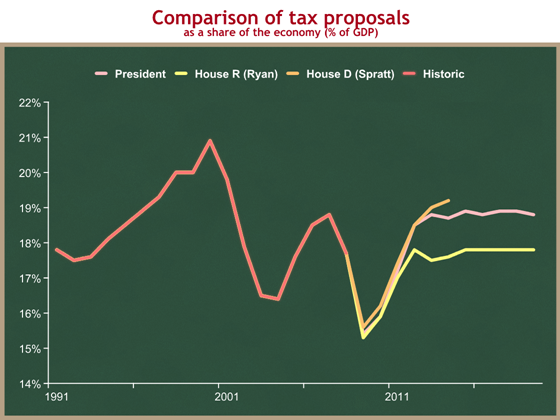
Let’s compare the President’s proposed total federal revenues, with proposals from House Republicans and House Democrats. The House Republican proposal was authored by the ranking Republican on the House Budget Committeee, Rep. Paul Ryan (R-WI). The House Democrat proposal passed the House, and was authored by the House Budget Committee Chairman, Rep. John Spratt (D-SC).
From this graph you can see:
- Over the next few years, all three proposals show a steep dip in revenues, followed by a steep increase. This has nothing to do with policy and is entirely about the predicted recession and recovery.
- The President’s budget would have the government take 0.9 percentage points more of the economy than the Ryan proposal. That’s an extra 90 cents out of each $100 of income. This is a fairly steady gap over time.
- The budget passed by House Democrats has higher taxes than even the President’s budget. The House Democrat budget is only a 5-year proposal, so the long run gap could be bigger, but the House is collecting at least another 0.5 percentage points more than the President’s budget. The budget passed by House Democrats means that government will take an additional 50 cents out of each $100 of income above what the President proposed. Compared to the House Republican alternative, the House-passed budget would take an additional $1.40 out of each $100 of income for the federal government. That’s a lot.
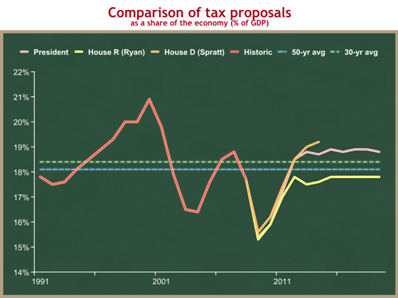
Now let’s compare these proposals to the historic average. I’m a low-tax guy, so I would like to use the post-WWII average of 17.9%. In most discussions, however, the range ends up being between the 50-year average of 18.1%, and the 30-year average of 18.4%. I will include those bounds on this graph, even though my preferred comparison path is a bit lower than the lowest line.
By adding these historic averages, we can see that the House Republican proposal would bring revenues down to a bit below the 50-year historic average. Even under this proposal, the federal government would be getting more inflation-adjusted dollars each year, because a constant percentage still grows in real dollars as the economy grows.
The Obama tax proposal is above the top end of the historic range, and the Democrat House-passed budget is above even that.

