House Budget Committee Chairman Paul Ryan released his budget today. Let’s compare Chairman Ryan’s proposed medium-term deficits and debt with the President’s.
This is the second in a three part post.
- President Obama’s proposed medium-term deficits
- (this post)
- How will President Obama respond this year to Chairman Ryan’s lower deficits and debt?
If you have not done so already I recommend you first read yesterday’s post on the President’s proposed deficits. You will see why I am focusing on displaying proposed results rather than proposed changes. I hope that today’s post drives home my point about the benefits of apples-to-apples comparisons of results without the distraction of the baseline/increase/decrease squabbling.
Here is yesterday’s deficit graph with a new line added in red for the Ryan budget.
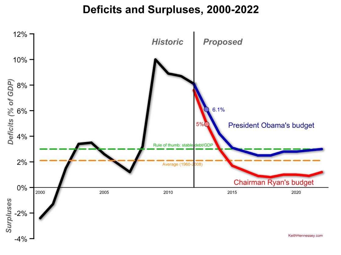
I won’t repeat yesterday’s explanation of the chart, which includes explanations of the green and orange lines. The historic line is now black. Now we can compare the President’s budget in blue to the Ryan budget in red. As always, everything is measured relative to the economy (% of GDP).
This chart makes the deficit comparison easy:
- The Ryan budget proposes a 5% deficit for FY13, lower than the President’s proposed 6.1% deficit for that same year.
- Chairman Ryan’s proposed deficits are lower than the President’s proposed deficits in each year of the next ten. The gap widens over time to a maximum of two percentage points in 2021.
- The Ryan deficits would drop below the 2.1% historic average in 2015 and would remain significantly below the average through the rest of the 10 year budget window. The President’s budget is above the average in each year of the next 10.
- At the end of the decade Chairman Ryan proposes a 1.2% deficit compared to the President’s proposed 3.0%.
We can do the same thing with debt.
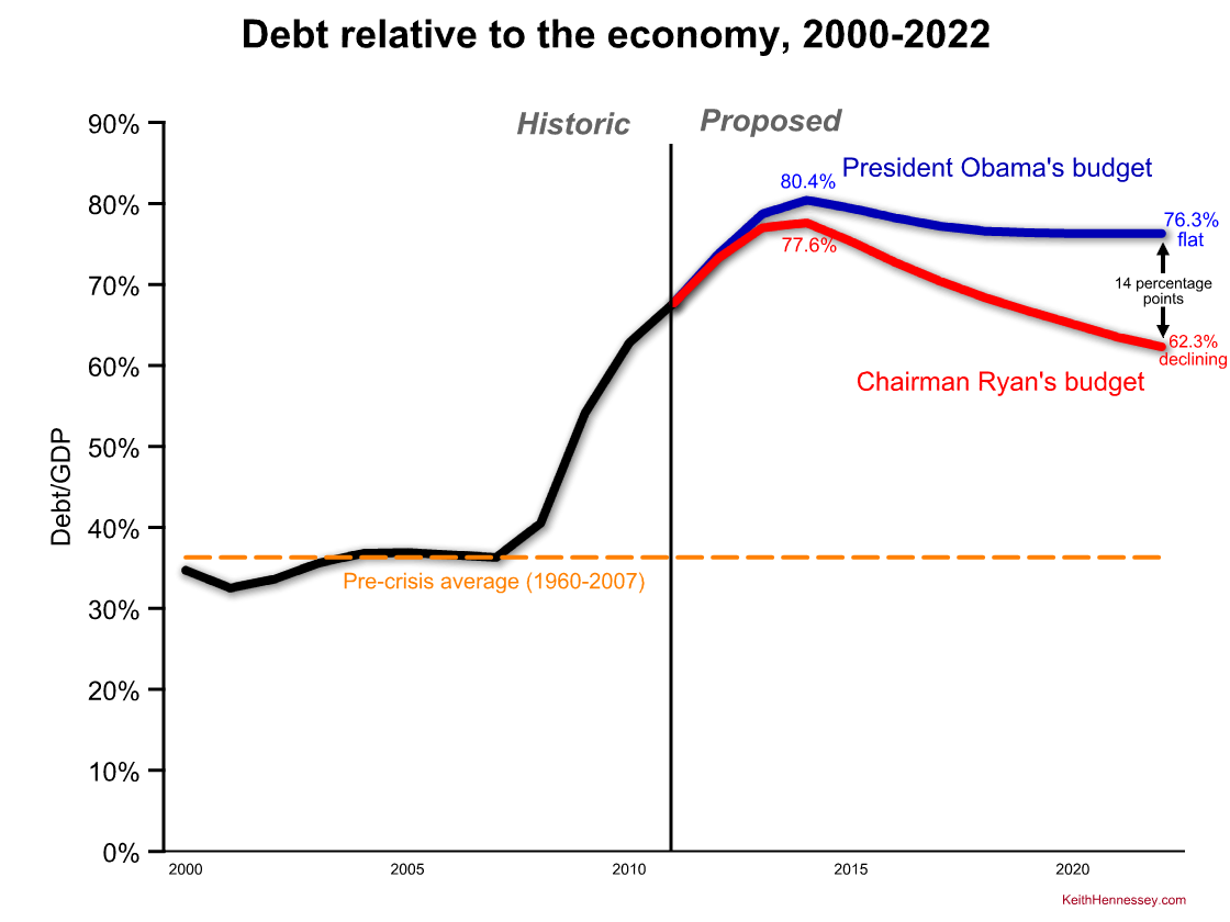
Again by focusing on results rather than changes relative to a disputed baseline, the comparison is quite easy:
- Under the Ryan budget debt would peak at 77.6% of the economy in 2014. Under the President’s budget debt would peak at 80.4% of the economy in that same year.
- The Ryan budget would cause debt to steadily decline to 62.3% of GDP by the end of the decade. Under the Obama budget debt would flatten out by 2018 and end the decade at 76.3% of GDP, 14 percentage points higher than under the Ryan budget.
- At the end of 10 years debt would be declining relative to the economy under the Ryan budget, while it would be flat under the President’s budget.
- For comparison the pre-crisis (1960-2007) average debt/GDP was 36.3%.
Conclusion: Over each year of the next decade the Ryan budget would result in lower deficits, less debt, and a better long-term debt trend than the President’s budget.
This deficit and debt comparison poses a strategic challenge to the President identical to one he faced last year. In a separate post I explain this challenge and the President’s options.