House Budget Committee Chairman Paul Ryan released his proposed budget plan yesterday. This will be the focal point of America’s fiscal policy debate for at least the next two years, so I’m going to write about it quite a bit. Today I’ll start by showing you the macro fiscal picture, and by comparing Chairman Ryan’s budget to President Obama’s. Since most people don’t enjoy a good table of numbers as much as I do, we’ll compare them visually.
We’ll look at the short-term first, then the long-term.
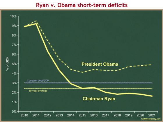
Let’s begin by comparing the short-term deficit effects of the two proposals. On each of the following graphs, solid lines represents Chairman Ryan’s budget and dashed lines represents President Obama’s budget. Spending will always be in red, taxes in blue, and deficits and debt in yellow. Everything is measured as share of the economy. As always, you can click on any graph to see a larger version.
Conclusions:
<
ul>
Now let’s compare the two proposals’ short-term effects on debt held by the public.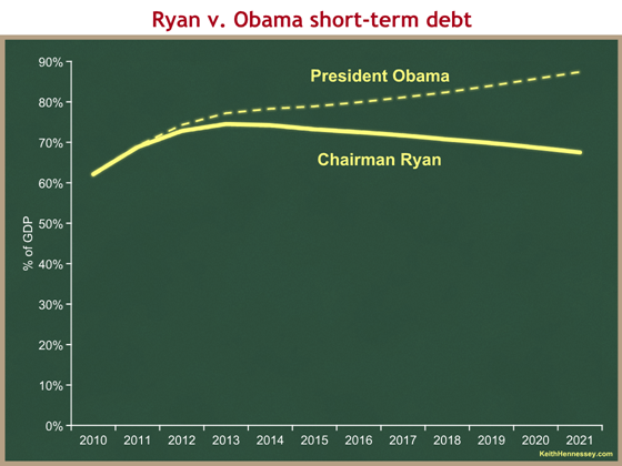
Conclusions:
- Chairman Ryan’s budget would result in debt increasing as a share of the economy this coming year and the next one. Debt/GDP would then gradually decline after that, and would be declining at the end of the next decade.
- President Obama’s budget would result in debt increasing as a share of the economy for every year of the next decade, and would end the decade on an increasing trend line.
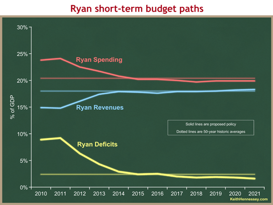
Deficits and debt are critically important metrics of any budget proposal, but by themselves they provide an incomplete and therefore inadequate picture. We can learn a lot by disaggregating the net deficit numbers into their gross spending and tax components. Let’s set aside the President’s proposal for a moment, and compare Chairman Ryan’s short-term spending and revenues to historic averages.
Conclusions:
- Chairman Ryan’s budget would, within four years, bring spending in line (below, actually) the 50-year historic average share of the economy (20.4%).
- As the economy recovers, revenues would climb to meet the 50-year historic average share of the economy (18.0%) and basically hover around that line over the next decade.
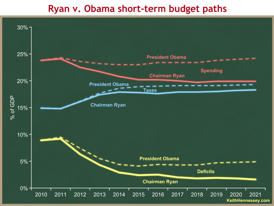
Now let’s compare Chairman Ryan’s and President Obama’s proposed short-term spending and revenues.
Conclusions:
- Over the next decade Chairman Ryan proposes lower spending, lower taxes, and smaller deficits than President Obama proposes.
- The difference in their proposed revenue paths is much smaller than the difference in their proposed spending paths.
- By the end of the decade, Chairman Ryan proposes that taxes be 1% of GDP lower than President Obama proposes. In comparison, Chairman Ryan proposes that spending be 4.3% of GDP lower than President Obama proposes.
- For the last half of the next decade, the Ryan budget would result in stable spending and revenues as a share of the economy. Neither would grow as a share of GDP. In contrast, President Obama’s budget would result in government steadily growing over the next ten years, as government spending consumes an increasing share of society’s economic resources.
- While it’s not shown on this graph, we saw from an earlier graph that the Ryan budget would bring government spending and taxes in line with their 50-year historic averages. Under the President’s budget, government would continue to consume a historically unprecedented large share of the economy, and taxes would rise to high levels relative to the past 50-years.
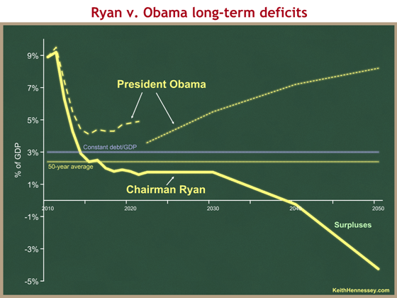
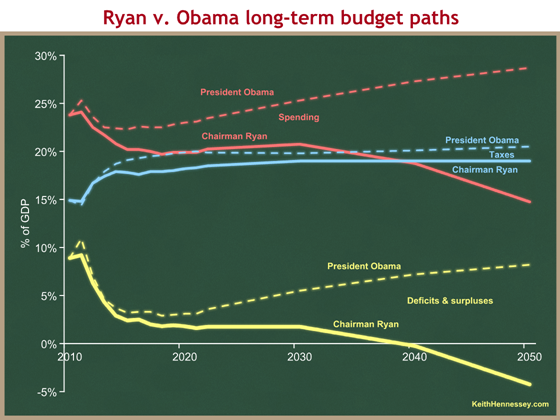
OK, now let’s look at the long run. We’ll start with deficits.
I have two different dotted lines for the President’s deficit path. The short-term path comes from CBO. But since CBO didn’t do a long-term analysis of the President’s budget, I’m forced to rely on OMB’s projections for the President’s long-term deficit. You can see the big gap in 2021, representing the different scoring from two different agencies. This suggests that a CBO projection of the President’s long-term deficit would be higher than what you see here. Thus, this graph probably understates the President’s long-term deficit. It is therefore unfairly generous to the President’s proposal.
Conclusions:
- Chairman Ryan’s budget would result in smaller deficits than President Obama’s budget forever.
- Chairman Ryan’s budget would eventually reach balance and then surplus. The President’s budget would not.
- After bringing the deficit down to the high 1’s by the end of the next decade, the Ryan budget would hold it there for another ten years. The deficits would then decline, resulting in a balanced budget a little before 2040 and ever-increasing surpluses beyond that.
- The President’s budget would result in deficits that never drop below 3% of GDP, and after 2018 increase forever. That deficit path is unsustainable – at some point something in the economy would break.
We’ll end with a comparison of the two proposals on spending and taxes. I have the same data problem as on the last graph. Mixing OMB and CBO numbers for the President’s budget would be way too messy here, so I’m forced to rely on OMB numbers since it’s the only set I have for the full timeframe. This means that the spending and deficit lines for the President’s budget are lower than if I had an apples-to-apples comparison. In other words, this graph is unfairly generous to the President’s budget. Even so, we can still learn a lot.
The key to this graph is to compare the long-term slopes of the red lines, then the blue lines, then the yellow lines.
Conclusions:
- The two proposals have radically different long-term spending lines because the President’s spending slopes up and Chairman Ryan’s slopes down. They are also at different levels, but the difference in slopes is even more important.
- The two proposals have different tax levels, but they are both basically flattish in the long run.
- The ever-increasing gap between the red spending lines dominates the basically stable gap between the blue tax lines.
- The huge and ever-increasing gap between the deficit proposals is therefore a result of fundamentally different approaches on spending. The tax differences between the two proposals are a relatively small component of their different deficit paths.
In these graphs I have shown you only the results of the Ryan budget. I have said nothing about what specific policy changes he proposes to achieve these results. I will write about these soon. In the meantime you can learn more about his proposal at the House Budget Committee website.
