Today President Obama’s Council of Economic Advisers, chaired by Dr. Christina Romer, released the annual Economic Report of the President. The economic projections in the report and form the baseline for the President’s budget and all Administration policy making through the year.
We can learn a lot from these projections. I will focus on employment.
Projected unemployment rate
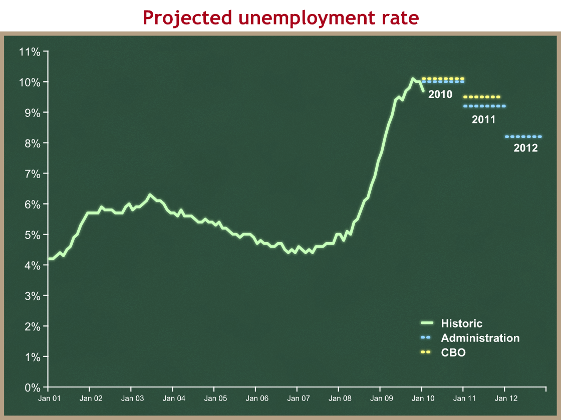
Here is a comparison of the historic unemployment rate, the Administration’s projection, and CBO’s projection.
I need to make an important caveat: the Administration and CBO project average unemployment levels over each year. As an example, CEA projects unemployment in 2010 will average 10.0%, and CBO projects it will average 10.1%. Since I don’t have monthly data, I have graphed the average rate as if it were the rate for each month in the year. This is an inaccuracy in my graph and an oversimplification, but an unavoidable one given the limited data we have. It’s why the projections look like stair steps rather than smooth lines.
We know from other sources (including the text of the CEA report) that they project the rate will in fact roughly hold constant for 2010, so a downward slope probably begins in 2011.
Even with this oversimplification we can draw a few conclusions from this graph:
- For at least the first month of 2010, the unemployment rate is better than projected. (Then again, this may be because workers are dropping out of the labor force.)
- CBO’s projections are slightly more pessimistic than CEA’s. It’s not a huge difference, though.
- The Administration projects the unemployment rate will be high throughout President Obama’s term.
- For purposes of political analysis, CEA projects a 10% average unemployment rate this election year, and an 8.2% average in 2012.
Projected number of people working
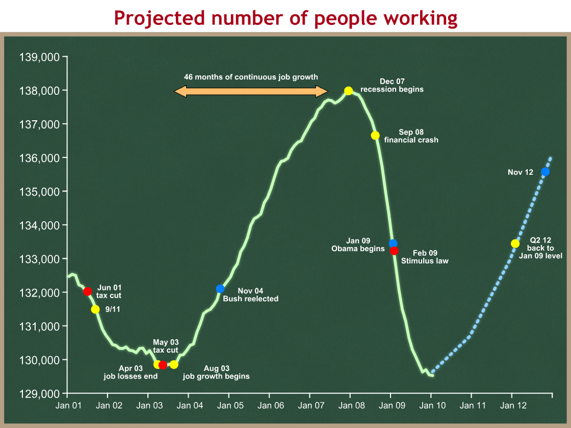
I think the second graph is even more interesting. I have loaded it up a bit. Click it for a bigger version.
A similar caveat applies to this graph. The CEA report (table 2-3 on page 75) projects the average monthly change in the number of people working, averaged out over a calendar year. Lacking a more refined projection, I have assumed a constant monthly growth rate during each calendar year equal to that average. This is an unavoidable oversimplification and inaccuracy in my graph of their projection, but it’s the best that can be done with this data. If their projection holds the real world won’t look this smooth, but it will be sloped up like I have shown.
Example: CEA projects job growth in 2010 will average +95,000 jobs per month. I have graphed this as a straight line beginning in January, with each month 95,000 jobs higher than the prior one. CEA is not necessarily projecting such smooth growth, or even that it begins in any particular month in 2010. They do project average monthly employment growth of +95,000 net new jobs.
I have added some historic reference points to the graph. I think they tell an interesting story, beginning with the Bush Administration:
- You can see the economic recession resulting from the bursting of the tech bubble as President Bush takes office in January 01. Look – he inherited a recession.
- In June of 2001 we enacted his big tax cut. Would it have stopped the recession and the job loss? We’ll never know because 9/11 hammered the economy. You can see the dramatic job loss continuing into early 2002.
- Things flatten out in 2002. The President and his team were worried, however, of another downleg. At the beginning of 2003 President Bush proposed another tax cut.
- In April of 2003 employment flattened out. The President signed the 2003 tax cut in May.
- In August 2003 we began 46 months of continuous job growth, the second longest period since they started keeping track in 1939.
- A mild recession began in December 2007 and employment began to decline.
- In September 2008 the financial crisis occurred. Economic growth and employment plummeted.
It’s also interesting to note that employment was almost precisely the same at the two Bush inaugurals. We lost jobs for 2 1/4 years, plateaued for five months, and grew rapidly for 1 3/4 years. This raises a political question: how important to reelection is the level of employment/unemployment rate, versus the direction and rate of change?
Turning to President Obama’s time in office and remembering the graph’s oversimplification, we can see:
- Employment continued to plummet since the President took office and since enactment of the stimulus in February 2009.
- It appears that employment has flattened out (from the flattish green segment at the end). We sure hope it has.
- The Administration/CEA projects modest job growth in 2010, only enough to keep up with population growth: +95,000 jobs per month on average. That projection is generally consistent with a steady unemployment rate.
- CEA projects +190,000 jobs per month on average in 2011, and +251,000 jobs per month on average in 2012.
- If those projections play out, and if they are relatively smooth (my assumption, not CEA’s), then the Obama Administration will reach a point of net job creation during its tenure in the second quarter of 2012, and be at that last blue dot on Election Day.
- We would still be 2.5 – 3 million jobs short of the December 2007 high point. But since the potential labor force grows over time, the unemployment rate would be much higher (probably high 7s) than the 5.0 percent we had in December 2007.
The Administration has taken a lot of grief for missing the depth of the recession when they took over. I do not fault them for an inaccurate projection – these things have huge error margins, and to a large extent they are nothing more than educated guesses. Nobody knows what the economy will look like eighteen months from now. The Administration’s foul was rather in overselling their projections, and in particular the projected effects of the stimulus, to convince Members of Congress and the public to support their desired policy.

