Here is your key data:
- The U.S. economy lost a net 85,000 jobs in December 2008.
- The unemployment rate held constant at 10.0%.
- Average weekly hours held constant.
I will show you my two favorite employment graphs, then give some thoughts about the intersection of the economics and the politics. This report was more important politically than it was economically. As always, you can click on a graph to see a bigger version.
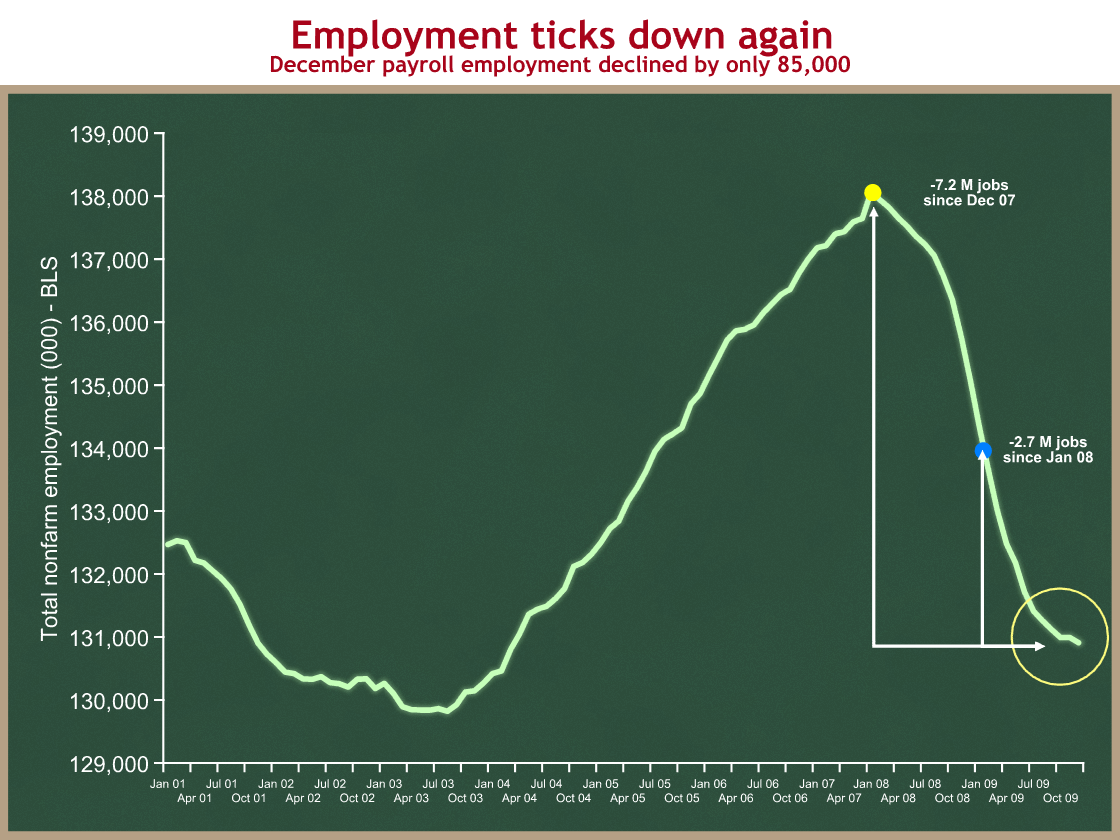
I’m going to show you employment levels. Most others show you changes in levels. If you look inside the yellow circle you can see the -85,000; it’s the downleg at the very end of the graph, after the little flat part. That difference between flat and downward is what has everyone nervous. They are trying to figure out whether it will be flat in the near future as a prelude to going up, or whether last month’s downtick represents a continuation of the longer term downward trend.
One thing I like about this graph is it helps me keep perspective. In this case, one bad data point does not make a new trend, but then again, maybe the recent flatness was an anomaly. If we see a similarly-sized job loss next month, then I’ll get worried. Until then, for me yesterday’s report is an “uh-oh,” rather than an “oh no.”
The other useful feature of this graph is it shows how deep of an employment hole we’re in. The economy needs to create 2.7 M net new jobs to return to the employment level when President Obama took office (this is politically but not economically significant), and 7.2 M net new jobs to return to the high point of December 2007. Since the population and potential labor force are always growing, we need the economy to create even more than 7.2 M net new jobs to return to full employment.
Now let’s look at the unemployment rate.
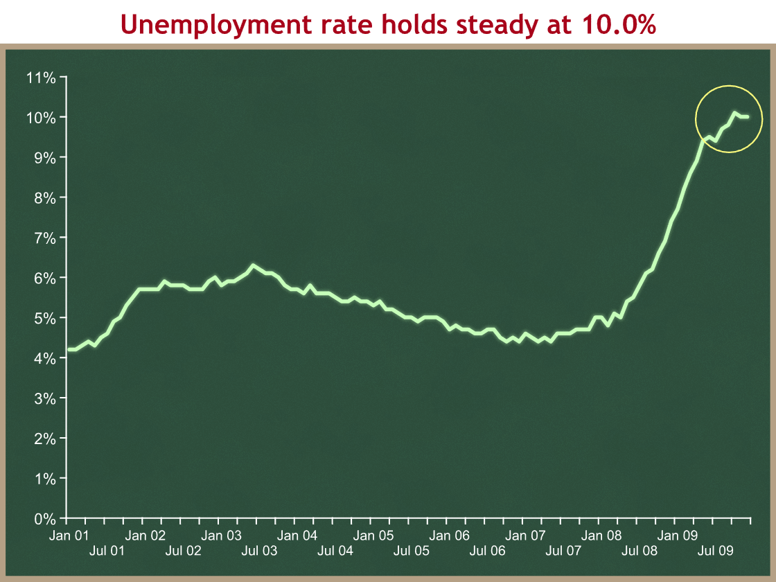
Inside the yellow circle you can see the rate holding steady at 10.0%. Economists I trust use 5.0% as their rule-of-thumb for full employment. Respectable experts seem to cluster in the 4.8 – 5.5 range. Whatever point you pick as full employment, we have a long way to go.
Together these graphs appear to tell a story of a very weak job market that is not yet improving. Please remember that the debate on CNBC and on the editorial pages focuses on the direction of the graph within the yellow circle, and does not pay enough attention to the huge employment gap between where we are now and where we’d like to be. Both are important.
The President’s comment yesterday reinforces my point:
Job losses for the last quarter of 2009 were one-tenth of what we were experiencing in the first quarter. In fact, in November we saw the first gain in jobs in nearly two years. Last month, however, we slipped back, losing more jobs than we gained, though the overall trend of job loss is still pointing in the right direction.
He’s accentuating the positive (which is fine) comparing the downward slopes of two segments on the first graph, and saying that the recent downward slope is much more gradual than the earlier one. He’s right, but that’s only part of what matters. It’s still going down, which is bad, and, equally importantly, even when it starts going up, we have a long hill to climb.
Politics
If anyone looks back at what the President and his team have said in prior months, they’ll see evidence of touting one month increases and ignoring one month decreases. It is politically risky to run out and take credit after only one good month. You need to let a positive trend build before drawing conclusions about the future. This is hard to do in a White House, especially when you have been waiting a long time for good news.
As we bounce around zero net change, the politics of the +/- sign are far more significant than the number. There is little economic difference between, for instance, +25K jobs and -25K jobs, but the political difference is enormous. Today’s bigger minus sign puts the Administration and its allies on economic defense in the political fray. They are trying to argue that things are improving and their policies are working, but they have to point to a longer term slowing of the decline, overlooking the continued decline, last month’s bad data, and the huge employment gap. They’re actually right that the economy isn’t declining anywhere nearly as rapidly as when the President took office, but that’s not really saying much. I think they are overstepping when they try try to frame slower declines as good news.
If you’re a political junkie, the past few weeks are a tremendous example of why American politics is so fascinating. On December 24th, everyone in Washington knew that January would be focused on the health care conference, a slowly but steadily improving economic picture, and a new focus on the budget deficit. In less than three weeks the political narrative has been transformed. It is now about a terrorist threat and intelligence failures, an economy that may be weakening again, Democratic retirements and party switches, and, oh yeah, finishing health care conference and a new focus on the budget deficit. From the White House perspective, all of these changes were exogenous. They are forces to which the President and his team must now adapt.
I’ll bet that State of the Union draft looks quite different than it did three weeks ago.

