Here is President Obama in the Rose Garden last Friday:
Today we’re pointed in the right direction. We’re losing jobs at less than half the rate we were when I took office.
There is a difference between “good news” and “pointed in the right direction.” Friday’s jobs report was good news, but the economy is still not yet pointed in the right direction. We have a ways to go.
Beginning with his weekly address on August 1st the President has been saying that the economy is “pointed in the right direction” or “headed in the right direction.” He said this first after the 2nd quarter GDP report showed a 1.1% decline, and again after last Friday’s jobs report showed the U.S. economy lost 247,000 jobs in July. The President is making a common error by looking at the rate of change of a rate of change.
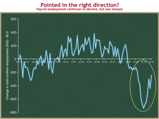
Here is the graph that shows why the President’s language sounds plausible. The vertical axis shows the net change in how many people were working from the previous month. (Click on any graph to see a larger version.)
The yellow oval shows why the President is saying “we’re pointed in the right direction.” Aside from the sharp one month drop in June, this graph is headed up from its low point in January 2009. You can see from this graph that for the first two-thirds of 2008, the economy was losing about 150,000 jobs each month. The bottom then dropped out, and we lost 741,000 jobs in January 2009. In July the economy lost 247,000 jobs. Things are getting better, right?
Wrong. Things are still getting worse, but less more slowly. The mistake is looking at the direction of a trend on a graph of a rate of change. When you’re looking at a graph that displays a rate of change, “things are getting better” if the latest point is above the horizontal axis, and things are still getting worse as long as you’re below zero. The economy is still losing jobs, and so we are not yet “pointed in the right direction.”
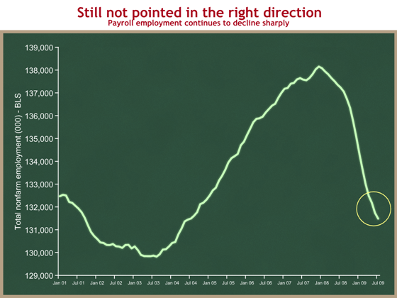
It’s easiest if I show you a different graph. Looking at the same timeframe, let’s graph levels of employment – how many people are working at any point in time.
You can see from this graph that employment peaked in December 2007 and has been steadily declining since. The employment levels turns downward when the rate of change crosses into negative territory, in January 2008.
If you look closely at the yellow circle, you can see that the very last part of the green line is tilted slightly less downward than the part before it. That’s the good news everyone began celebrating last Friday. Employment dropped by 443,000 from May to June, and by “only” 247,000 from June to July. This smaller decline shows up as a change in the downward slope of this line. But the line is still going down. Things are not getting better until that line turns up.
Imagine you’re in a car that has been rolling backwards downhill at high speed. Now the car slows down, but it’s still rolling backwards downhill, just more slowly. You are not headed in the right direction until you’re moving forward.
People in Washington try to show they’re sophisticated by focusing on the first graph, “Employment is still declining, but less rapidly. That’s good, right?” Yes, and there is an important distinction between “good news” and “headed/pointed in the right direction.”
- Financial markets care about expectations and rates of change. What will the future look like relative to today? Does the new data make my predictions of the future look better? Markets (and economists) focus on the first graph.
- People working in the real economy care about present levels. Do I have a job today? How big is my paycheck? This is better captured by the second graph.
If you focus on the former, Friday’s jobs report was good news. The 247,000 jobs lost in July was fewer than expected, and it raised people’s expectations about the future path of the economy.
From an employment standpoint, the economy will be headed in the right direction when the number of people employed is increasing – when the second graph turns upward, or when the first graph crosses into positive territory. A minimum break-even threshold is about +100K jobs per month – that’s roughly the number of jobs needed to keep up with population growth and keep the unemployment constant.
Even when that green line turns upward and we are in fact “pointed in the right direction,” we will still be down at least 6.6 million jobs from the high point in December 2007. We will then have a long way to go, and will need incredibly strong job growth to work our way back up to where we were. When the President says “We won’t rest until every American that is looking for work can find a job,” he is setting for himself a goal of roughly 7 million more Americans being employed than today.
Do the words matter? They do when they come from the President and when they are about such an important topic.
Friday’s jobs report was good news because the bad news beat expectations, and because it signaled that things might turn around more quickly in the future. But the President is wrong – the U.S. economy is not yet pointed in the right direction.
(photo credit: “Wrong Way” by lensfodder)

