Last Wednesday the Commerce Department released their final data for first quarter (Q1) U.S. GDP. GDP shrank at a 5.5 percent annual rate in the first quarter of this year. (This takes inflation out of the calculations, so we’re measuring the growth of real GDP.) That doesn’t mean it shrank 5.5% that quarter. It means that it shrank at a rate that, if extended through a whole year, would cause GDP to shrink 5.5% over the course of that year. If the economy is performing well, it’s growing a little faster than 3% per year. We were more than eight percentage points below that in the first quarter of this year.
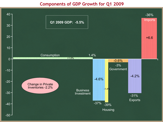
I find it useful to understand how the major components of GDP are performing. The graph below allows us to do that. I created this format while in the White House for my own use, and now I’d like to share it with you. Please bear with me – there’s a lot of information in one graph, and it may take some getting used to. Here’s the summary:
- The width of each component bar represents its share of GDP.
- The height represents the growth rate of that component. This growth rate is labeled in white immediately above or below that bar.
- The black number within the bar shows that component’s contribution to the overall growth rate of -5.5%
- Private inventories and Imports require special explanation.
Consumption is the widest bar. People buying stuff to consume accounts for, on average, about 70% of GDP. Right now it’s 72%. This explains why economists and market forecasters care so much about measures of consumption. If consumption grows modestly, the economy will grow. You can see from this graph that consumption grew at a 1.4% rate in Q1. Multiply 1.4% by 72% of the economy, and you get +1.0 percentage points of GDP, the number in black within the green bar. Consumers contributed to a positive 1.0% annual growth rate, while the rest of the picture subtracted 6.5 percentage points, resulting in a net -5.5%.
The bottom fell out of both business investment and housing in Q1, shrinking at rates of 37% and 39% respectively. Those are disastrous numbers. Since business investment accounts for about 11% of GDP, and housing only about 3%, you can see that the decline in business investments took 4.6 percentage points off the aggregate growth rate, while housing knocked off another 1.4 percentage points. While everyone focuses on housing, we shouldn’t lose sight of the much larger effect of plummeting business investment.
Most of the world economy is shrinking. People in other countries don’t want to buy our stuff, so our exports plummeted at a 31% rate. Similarly, we’re not buying stuff from other countries, so our imports declined 36%. Because of the way GDP arithmetic works, a decline in imports adds to GDP growth. This is the one big flaw in this graph format – I put the imports bar in positive territory because it adds to GDP growth, but imports actually shrank. I’d appreciate suggestions on how to make this work better visually. The net effect is that the decline in exports was more than offset by the decline in imports, so the effect of net exports (exports – imports) actually contributed 2.4 percentage points to GDP growth in Q1.
The bad news is that inventory investment was negative, subtracting 2.2 percentage points to the overall growth rate. The good news is that the change in private inventories contribution tends to be cyclical. As inventories get drawn down, there eventually is a need to rebuild those inventories. So while other drags (like housing) could continue for a while, I would expect that the pink oval will eventually move back into positive territory.
The overall picture is for Q1 was, unsurprisingly, bleak. Were it not for the consumer still continuing to spend, things would have been even worse.
The stimulus law will effect this eventually by raising that orange bar, government spending, into positive territory. The tax code changes and expanded unemployment insurance benefits have a small positive effect on the green consumption bar.
I wrote on June 3rd that I thought the Obama Administration made a huge mistake in the way they designed the stimulus, even given the President’s policy preferences. They’re pushing most of the money out through the government channel, represented by the orange bar above. The problem is that these dollars spend out incredibly slowly, and so the orange bar won’t be boosted significantly until Q4 of this year (at the earliest).
They should have pumped all the money out to consumers. Consumers would have saved more than half of those funds, but given that it was a $787 B package, if consumers spent only one-third that amount, you would have seen an immediate and significant upward bump in the green bar, beginning at the end of Q2 (now), and into Q3 and Q4. Stimulating consumption results in only a portion of the dollars going to higher GDP growth, but it happens much more quickly than trying to force money out the door through government bureaucracies. By allowing their Democratic Congressional allies to funnel stimulus dollars through government programs, they unnecessarily delayed the bulk of the positive economic benefit until next year.
Let’s hope the Q2 numbers are less bad. We will see the first data in the last week of July. Whatever the results, they will be largely independent of the stimulus, which is having only a small positive effect even now. The scary scenario is the one where the labor market continues to decline, and that causes consumption to go negative before the other sectors have time to recover.
