Yesterday we looked at the difference between the rate of growth of GDP and the level of GDP. Both matter. Today I’d like to do the same for employment.
Before I do, I want to point to some posts from Greg Mankiw (here, here, and here) that suggest a different hypothesis about the trend line for potential GDP. Demonstrating why he has the best selling economics textbook, Greg clearly explains the difference between a trend stationary forecast of GDP and the unit-root hypothesis. My post was based on a
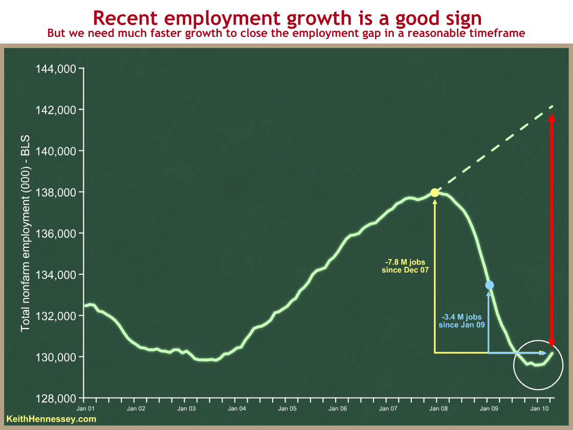
Here is the parallel graph for payroll employment (source: BLS, dotted line is my overly simplistic trendline):
When the President spoke Tuesday in Youngstown, Ohio, he emphasized the recent trend: the upturn in net job creation over the last four months, and the significant employment jump last month:
We gained more jobs last month than [at] any time in four years. And it was the fourth month in a row that we’ve added jobs – and almost all the jobs are in the private sector.
This statement is accurate in all respects. The President is right: the recent upturn in net payroll employment is clearly good news. Unlike his premature celebration last August, this new trend looks good and should be highlighted.
The +14K and +39K figures for January and February back up the President’s use of “fourth month in a row.” But as a practical matter it’s basically a flat line from last November through this February, with a positive upturn in March and April.
We have a similar issue with employment growth as we did yesterday with GDP growth. While the slope of the line is important, so is the size of the gap between where we are and where we could be. I have shown three measures of that gap, with yellow, blue, and red arrows. You can see that the U.S. economy is still employing 3.4 million fewer people now than when the President took office in January 2009. 7.8 million fewer people are working now than at the employment peak in December 2007. And given that the potential labor force grows as our population grows, the gap between where we are now and “every American who wants to work is working” (e.g., 5% unemployment) is even larger.
So the past two months of net job growth are good news but do not yet justify a victory lap. The unemployment rate is still 9.9%, and we need much faster job growth than +290K jobs/month to close that gap in any reasonable timeframe.
Here’s a back-of-the-envelope calculation I did a couple of weeks ago when the April jobs report came out:
- We’re down about 7.8M jobs (payroll survey) from the peak when we were at full employment in December, 2007.
- We added 290K jobs last month. What’s the trend?
- 66K of those 290K were census workers. Those are temporary jobs that will go away.
- 290K – 66K = 224K
- We need to create about 150K jobs per month just to keep up with population growth and roughly hold the unemployment rate constant. (Some say between 100K and 150K.)
- 224K – 150K = +74K. If we use 100K then we’re at +124K.
- So if April’s numbers became a trend, we’d be creating about 75K – 125K more non-temporary jobs each month more than needed to keep up with population growth.
- 7.8M / 100K = 78-ish months
So if March’s data were to become a trend, we would be looking at 5-6+ years to get back to something like full employment.
Now I’m not predicting that long of a recovery period. Instead, I’m trying to show that, while +290K jobs in April is a good number, and it is the most jobs created in any single month in four years, we need a much more rapid pace of net job creation for the foreseeable future to close the employment gap in a reasonable time frame. And the “best in four years” shouldn’t surprise you, as we should expect more jobs to be created during a recovery than when the economy is at or near full employment.
I expect the two parties will emphasize these two different aspects of the employment picture over the next six months of the election cycle:
- The President and Democrats: Things are getting better now. The economy is creating net new jobs.
- Republicans: Things are still bad. The unemployment rate is still high.
Barring a negative economic shock, both statements are likely to be correct for the remainder of this year. We’ll see whether voters care more about the level or the trend.
Update: Menzie Chinn critiques my graph, and he makes some excellent points. I was overly simplistic in my trend line (the dotted line) to the point where, were I writing this post anew, I would leave it out. I stand by my qualitative conclusions, and the point about trend vs. level is still one of the most important in this policy debate. But I don’t think the “5-6+ years to get back to something like full employment,” nor the dotted green nor red lines on the graph above, are solid enough for me to continue defending them. I stand corrected, and thank Dr. Chinn for his post.
