Here is a typical public debate about the budget deficit:
Republican: Republicans are for smaller deficits. You Democrats just want to increase spending. Republicans want smaller deficits by cutting spending.
Democrat: Hypocrite. You Republicans increase deficits by cutting taxes without paying for them. And you don’t really want to cut spending. Democrats are for smaller deficits through a combination of responsible spending cuts and tax increases.
Republican: When was the last time you enacted or even proposed a net spending cut? Even when you do propose to cut spending, you just turn around and respend the money on some new government program. You just want to raise taxes, then increase spending, leaving deficits exactly where they are. Sometimes you don’t even bother with the tax increase, you just increase spending. We are the party of lower deficits.
Democrat: You mean, like you guys did with Medicare or you do with defense everyyear? We are the party of lower deficits.
< one shoves the other and all hell breaks loose >
This kind of argument contributes more heat than light, in part because it focuses only on deficits and ignores a major philosophical distinction between the two parties: different beliefs about the appropriate size of government.
I am going to do my best to illuminate this debate by expanding its scope and introducing a new kind of graph. I call it a Budget Bubble Graph.
If this goes well we can use Budget Bubble Graphs to better understand the fiscal policy debate in Washington. We can compare different budget proposals, analyze historic fiscal policy differences, and easily visualize the effects of various legislative proposals. That’s a lot of responsibility for a little graph. Today I’m going to introduce the graph format and begin to show how it can help you think about the above fiscal policy food fight. I anticipate using Budget Bubble Graphs a lot in future posts. Today’s post is therefore something of an investment for the future.
Introducing the Budget Bubble Graph
Bubble graphs are not new. They are a standard graph type, a useful way to show three dimensions of data on a flat chart. As far as I know, it is new to use them for the federal fiscal policy debate.
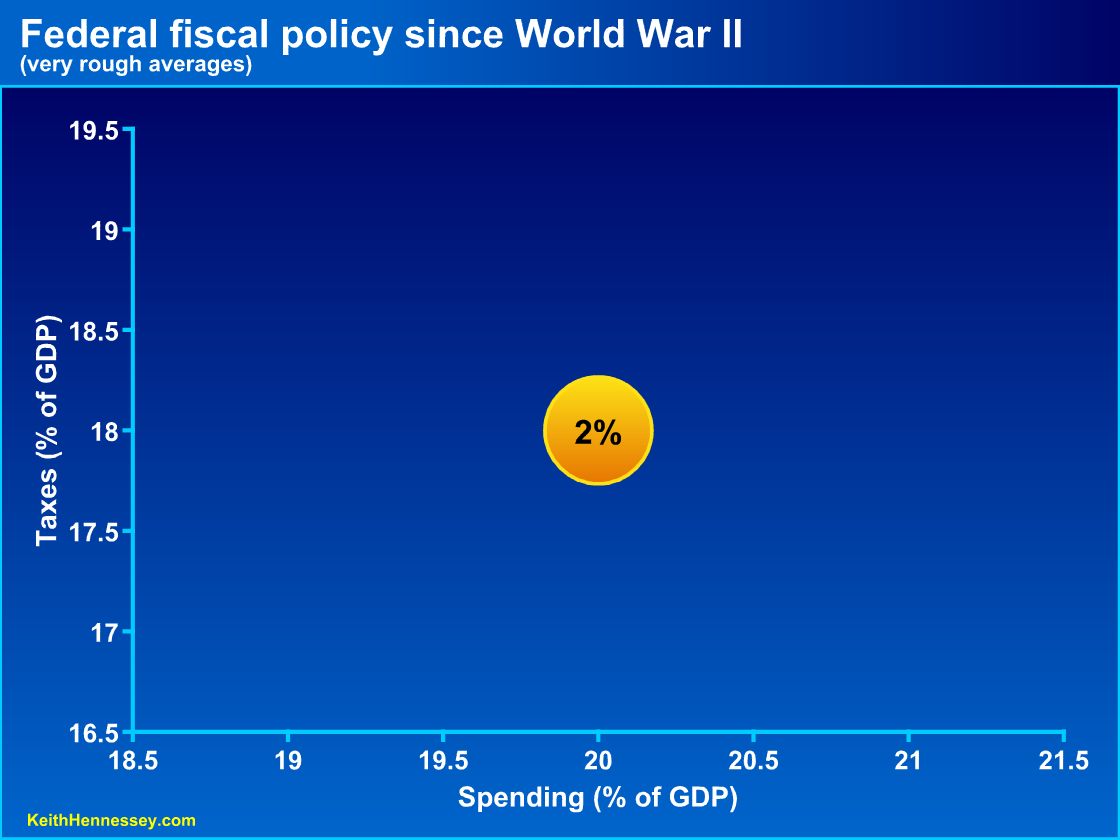
Let’s begin with the simplest possible graph. Since the end of World War II the federal government has, on average, spent a little more than 20% of GDP. Over the same time frame, it has financed this 20% by collecting a little more than 18% of GDP in taxes and borrowing the rest from future taxpayers, running an average deficit equal to about 2% of GDP. I’m going to round the numbers to 20-18-2 to make it easy. Frankly, the numbers matter little today. We’re just trying to get used to the format.
In each case you can click on a graph to see a larger version.
I want to point out a few subtle features about this fairly straightforward graph:
- I have put spending on the x-axis because that is the primary fiscal policy choice made in Washington: how much is the government going to spend?
- The secondary fiscal policy choice is: given how much we’re going to spend, how much of it are we going to tax now (y-axis) and how much are we going to borrow now (size of the bubble)? Whatever we borrow now we will have to collect in future taxes. Please think of deficits as equal to future taxes (with interest).
- That’s a deficit bubble equal to 2% of GDP. A bigger deficit would mean a bigger bubble.
- The 2% deficit bubble size is the difference between the amount we’re spending (20% on the x-axis) and the amount we’re collecting in taxes (18% on the y-axis).
- The bubble size is not to scale. If it were it would be much bigger. What matters for our purposes are the relative sizes of different bubbles. I tried scaling it to size and the graph became too cluttered.
Graphing the simplest possible fiscal policy changes
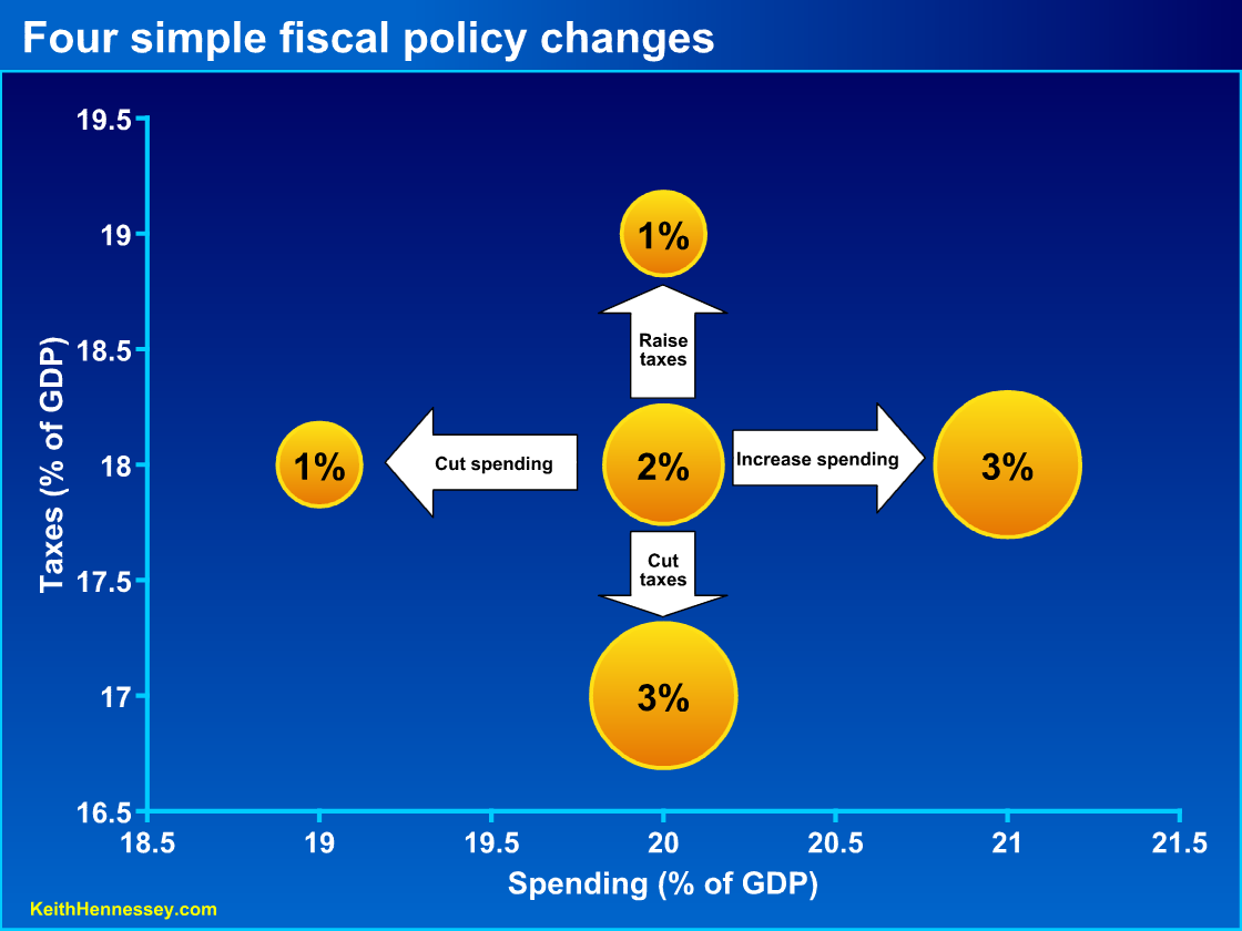
Now let’s look at the simplest possible fiscal policy changes:
- increasing spending by 1% of GDP;
- cutting spending by 1% of GDP;
- raising taxes by 1% of GDP; and
- cutting taxes by 1% of GDP.
Please pay attention to the effect of each policy change on the deficit.
Starting from 3 o’clock on the graph, if we raise spending from 20% of GDP to 21%, we move right on the graph. If we collect the same 18% of GDP in taxes (i.e., don’t move up or down), then we need to borrow 1% of GDP more, so our deficit bubble increases from 2% of GDP to 3% of GDP. (The relative areas of the bubbles are properly scaled.) Bigger bubble = bigger deficit = more borrowing now = higher future taxes.
Similarly, if we cut spending by 1% of GDP to 19% and hold taxes constant, we move left and reduce the budget deficit to the smaller 1% bubble at 9 o’clock on the graph.
You can see that if we change spending and hold taxes constant, the deficit changes to match the change in spending. The 3 o’clock bubble represents a deficit-financed spending increase. The 9 o’clock bubble represents a deficit-reducing spending cut.
Now let’s turn to taxes. Starting with the 12 o’clock bubble, if we hold spending constant at 20% and raise taxes by 1% of GDP, from 18% to 19%, we move straight up and reduce the budget deficit from 2% to 1% of GDP. This is a deficit-reducing tax increase. I think of this policy change as shifting the burden of financing a given level of spending from future taxpayers to current taxpayers. We get higher taxes now and lower taxes later.
Finally let’s look at the 6 o’clock bubble. If we hold spending constant and cut taxes by 1% of GDP, we increase the budget deficit from 2% to 3% of GDP. We are shifting the burden of financing a given level of spending from current taxpayers to future taxpayers.
Straightforward, no? Please note that this graph format is designed to be value neutral. It is simply an analytical tool.
We care about deficits and the size of government
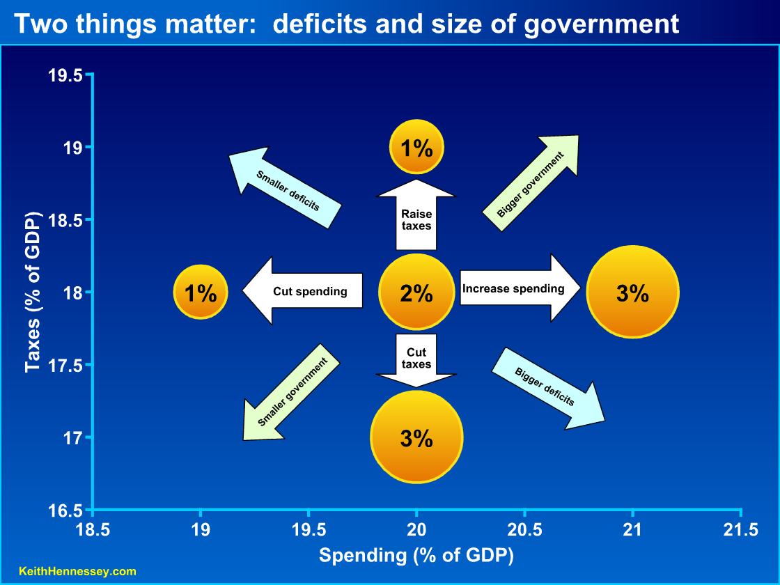
Let’s add one more layer of complexity. I am going to add four diagonal arrows to the above graph. Click the graph to see a bigger version.
You can see that as we move up and/or to the left, deficits get smaller. This makes sense – if we cut spending, raise taxes, or both, we get smaller budget deficits.
Deficits get bigger as we move down and/or to the right. If we increase spending or cut taxes, we get bigger budget deficits.
Moving up and/or to the right represents bigger government, and moving down and/or to the left represents smaller government. You could make the case that we should just look at spending to determine the size of government, but the policy debate suggests to me that diagonal arrows are more appropriate.
Now let’s use this tool to think about elements of the fiscal policy debate.
Our first strategic examples
Let’s use two graphs to look at the core philosophy driving the President’s and Congressional Democrats’ fiscal policy argument. While the details of PAYGO are a little funky because they apply only to some types of federal spending, these two graphs represent the underlying concept.
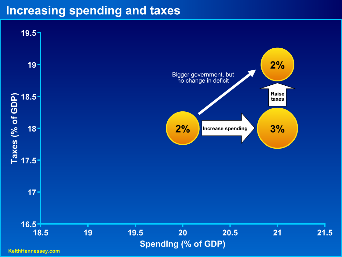
Under this logic, it’s OK to increase spending as long as you pay for it with higher taxes. If you move 1 percentage point (or any other amount) to the right by increasing spending, you have to raise taxes by an equal amount. The spending increase by itself would make the deficit bigger (2% to 3%), but the tax increase then reduces the deficit back to its original size. Government is bigger (higher spending and higher taxes), but the deficit has not increased.
In political rhetoric this is labeled (generally by opponents) as tax-and-spend. It’s probably better to think of it as spend-and-tax.
Here is where our budget bubble graph starts to get useful. Advocates for these policy changes argue that, since the deficit is unchanged, this policy change has had no major economic effect. “We have paid for our spending increase,” they argue, “our policy change does not increase the deficit.”
True. But this ignores that someone is paying higher taxes now. By moving up we are making someone pay more to the government. The right-then-up move illustrated above is a major fiscal policy change, and it is highly misleading to argue that it is insignificant because the deficit is unchanged. This is the primary purpose of Budget Bubble Graphs – to highlight major fiscal policy changes that are obscured by a one-dimensional focus on the size of the deficit.
Some advocates (on both sides of the partisan aisle) focus on the deficit with the intent of obscuring a significant change in the size of government. Many others in government and the press unwittingly ignore this component of major fiscal policy decisions.
In this example, the amount the government is borrowing from the private sector is unchanged, but the amount the government is taking from the private sector has increased. Whoever is paying these higher taxes has fewer resources to pay their family bills or expand their business. That is a significant consequence of this policy.
In addition, there is an economic efficiency loss from raising most kinds of taxes. Economists call this deadweight loss.
I have described what PAYGO allows in this case. It’s more accurate to think of PAYGO as a limitation. The intent of this part of PAYGO is not to move up on the graph. It is instead to prevent you from moving right without also moving up. If you want to spend more (move right), you have to
A dangerous side effect of this philosophy is concluding that if this PAYGO philosophy allows something, it is therefore fiscally acceptable or insignificant. I hope the above example demonstrates at a minimum that a big spending increase offset by an equally large tax increase is not insignificant. I also think it’s bad policy, but that’s a value judgment on my part.
Now that’s just one side of the pay-as-you-go philosophy. Here is the other side.
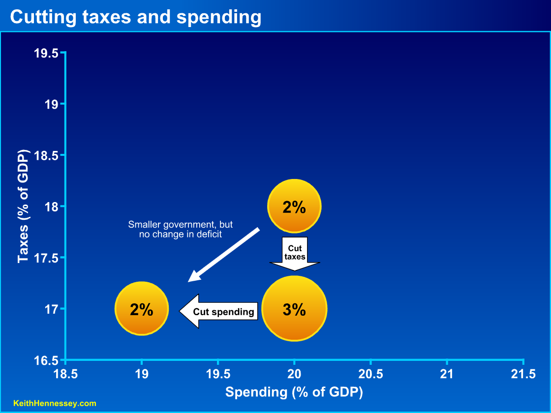
Under this set of PAYGO rules favored by the President and many of his Congressional allies, you can move down (cut taxes) only if you also move left (cut spending). It is again a limitation — you may not cut taxes (and thereby increase the deficit) unless you also [raise other taxes or] cut spending by at least an equal amount. Once again, the details allow only cuts in certain types of spending to count, but we can ignore that here.
In this graph policy makers cut taxes by 1% of GDP, increasing the budget deficit from 2% to 3%. They package this tax cut with spending cuts to keep the deficit at 2% of GDP. The deficit is unchanged from the starting point, but government is smaller as measured by either spending or taxes. Since the deficit is unchanged we have not increased future taxes. Since taxes are lower now, individuals, families, and firms have more resources today to use however they best see fit.
In future posts we can examine the Republican view of the PAYGO world and why it’s so hard to get a bipartisan agreement to reduce the budget deficit. Much of the partisan disagreement concerns proposals to move straight up or straight down on the graph, and we’ll look at that. We can also use Budget Bubble Graphs to analyze different examples of major legislation now being debated as well as for other interesting analysis.
My point today is simply to introduce you to this type of graph and to use it to demonstrate that we should care about both the deficit and the size of government. I have focused on the simplest examples to get you accustomed to using these graphs to help think about fiscal policy.
We have just scratched the surface of Budget Bubble Graphs. Stay tuned for more.
