The President proposed his budget today. This is the budget for federal fiscal year 2011, which begins October 1 of this year.
Most people in Washington will focus on (1) the effects of the proposed budget on the deficit and (2) what the budget proposes for specific policies they happen to care about.
I will focus on the size of the proposed budget relative to the rest of the economy. The deficit is an important but incomplete measure of this. It’s important to remember that every dollar not spent by the government is a dollar that can be spent by individuals, families, and firms. We should care not just about the difference between spending and taxes, but also on how big government is relative to the private sector.
Throughout this post I will describe things as a share of the economy (% of GDP). This is a useful way to compare budgets across time but it is biased in favor of bigger government. There is nothing that says that because the economy gets bigger that the government must grow along with it. I’d like to do these presentations in real (inflation-adjusted) dollars to eliminate this bias, but it would make my analysis difficult to compare with almost everyone else’s. For now I won’t fight this and will just use % of GDP.
Deficits
Let’s begin with the deficit. As always, click on any image to see a bigger version.
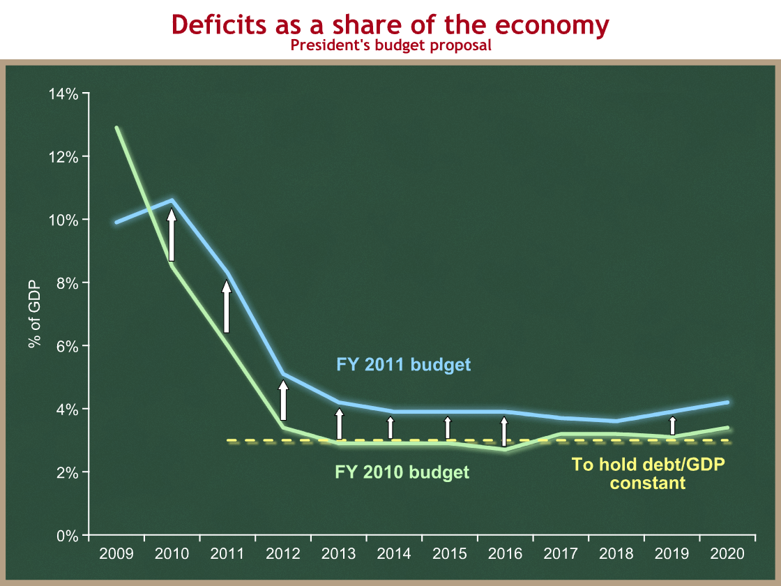
The green line shows deficits as proposed by President Obama last year. The blue line shows deficits as proposed by President Obama this year. The dotted yellow line shows the deficit consistent with holding federal debt (as a share of GDP) constant. If deficits are above this dotted yellow line, then our debt burden relative to our economy’s ability to pay for it will increase. If deficits are below that line, our debt burden will decline relative to the economy. (I’m oversimplifying a bit – the dotted yellow line should actually slope gradually upward depending on what happens to debt in the intervening years.) For now this maximum is 3.0% of GDP.
We can draw five important conclusions from this graph:
- At 8.3% of GDP, the proposed budget deficit for 2011 is still extremely high.
- President Obama is proposing larger budget deficits than he did last year.
- For 2011, the most relevant year of this proposal, the President is proposing a budget deficit that is 2.3 percentage points higher than he did last year (8.3% vs. 6.0%).
- Using his own numbers, the President’s proposed budget deficits will cause debt as a share of the economy to increase.
- Under the President’s proposal, budget deficits begin to increase as a share of the economy beginning in 2018.
Adding further detail to (4), the President’s own figures show deficits averaging 5.1% of GDP over the next 5 years, and 4.5% of GDP over the next ten years. They further show debt held by the public increasing from 63.6% of GDP this year to 77.2% of GDP ten years from now. I think it’s a safe assumption that CBO’s rescore of the President’s budget will be even worse.
From a macroeconomic standpoint, short-run deficit reduction is contractionary. Reducing the budget deficit toward manageable levels is necessary from a federal fiscal standpoint, but it reduces short-term economic growth. This is the Administration’s core short-term economic policy challenge, the tradeoff between fiscal stimulus and deficit reduction over the next 2-3 years.
Taxes
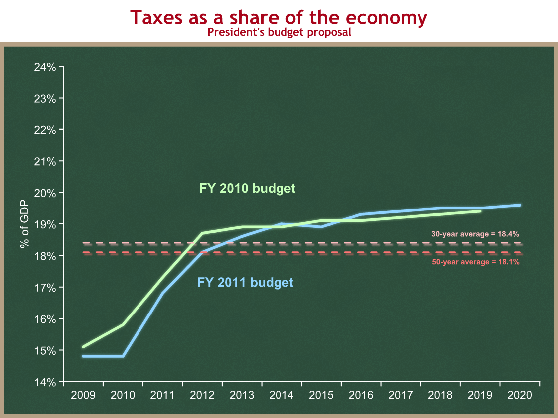
The green line shows total revenues proposed by the President last year, and the blue line shows this year’s proposal. The dotted pink and red lines show historic averages of the past 30 and 50 years.
You can see that taxes were really low when the President took office, a consequence of the severe recession. The big jump from 2010 to 2012 is a result of several factors all pushing taxes higher:
- as the recession ends, revenues will recover as a share of the economy;
- President Obama proposes to allow some of the Bush tax cuts to expire on December 31 of this year;
- He is proposing some other tax increases as well;
- The tax code has features that build in tax increases over time. The most important is known as bracket creep.
We can draw two conclusions from this graph:
- Taxes are low now, but are scheduled to increase to above historic averages.
- The President is proposing slightly lower revenues over the next few years than he proposed last year, but essentially no difference in the long run.
Spending
I saved the most important graph for last. Every dollar spent by the government must be either taken from someone in the private sector (taxes) or borrowed from the private sector (deficits).
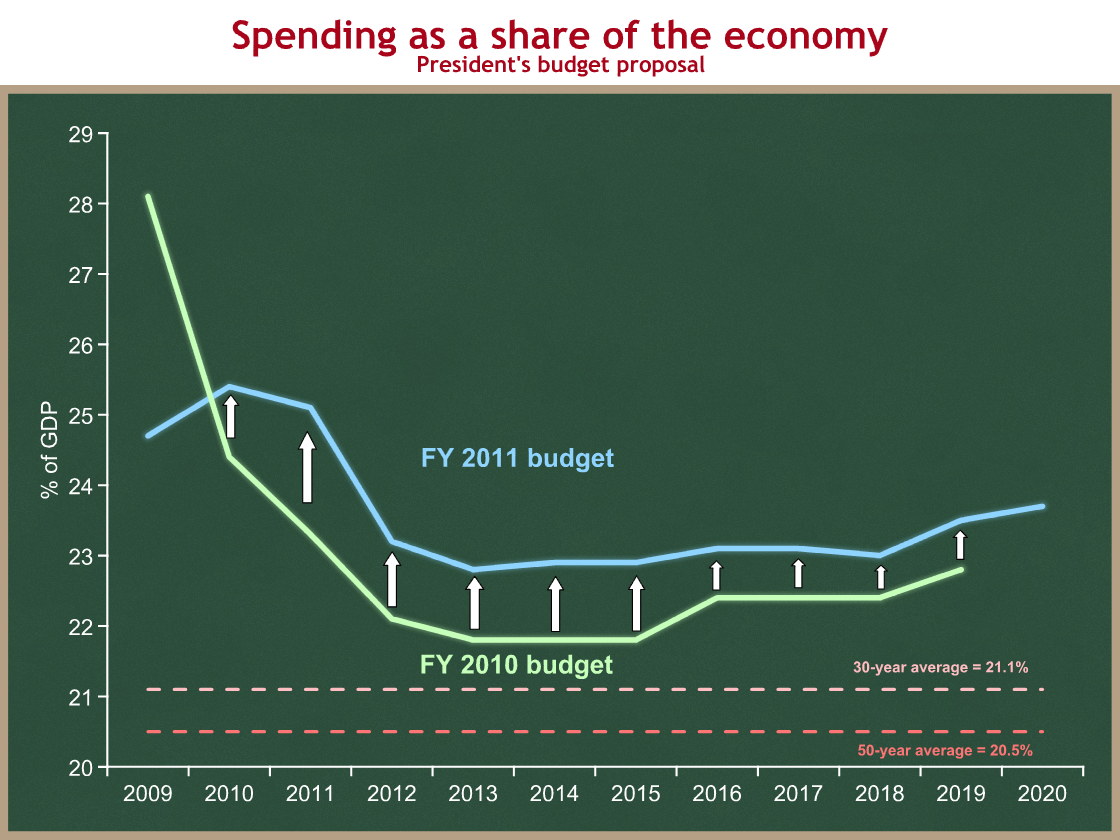
Again, green is last year’s proposal, blue is this year’s proposal, and dotted pink (30-years) and red (50-years) are historic averages.
We can conclude:
- The President is proposing significantly more spending than he proposed last year: 1.8% of GDP more in 2011, and roughly 1 percentage point more each year over time.
- Spending is and will continue to be way above historic averages.
At its lowest point in the next decade federal spending would still be 1.7 percentage points above the 30-year historic average. Over the next decade, President Obama proposes spending be 12% higher as a share of the economy than it has averaged over the past three decades.
Remember that fiscal policy is not just about the budget deficit, the difference between spending and taxes. It’s also about the size of government: how much is the government spending, and therefore taking from the private sector?


