Monday the President proposed his budget for Fiscal Year 2009. This is the first “e-Budget” – it was transmitted electronically as an official document to the Congress, and was digitally signed by the Executive Clerk.
At a press conference Monday, Senate Budget Committee Chairman Kent Conrad (D-ND) said:
But let me emphasize to you what I see in almost no stories: That is a four-letter word called debt. Nowhere do I see mentioned of what’s going to happen to the debt. It never leaves the administration’s lips. I have never seen it in a single story. I hear a lot of focus on the deficit.
No mention of what happens to the debt.
And I would suggest to you the debt is the threat. Why? Because if you look at what is scheduled to happen in this next year, according to the administration’s own estimates, while the deficit goes up over $400 billion, the debt will go up over $700 billion in one year. The big difference, of course, is Social Security money that is being used to pay other bills. It doesn’t get included in any deficit calculation, but every penny of it gets added to the debt.
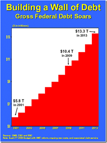
The result is, under the Bush administration proposal, they are building a wall of debt. At the end of his first year, the gross debt of the United States stood at $5.8 trillion. We don’t hold him responsible for the first year because he wasn’t in charge the first year. The budget, as you know, is presented by the president outgoing.
If you look at the end of his eight years of responsibility, we see the debt as being over $10.4 trillion. That is almost a doubling of the national debt on his watch. You will recall, he said paying down the debt was a high priority. And we see the debt further escalating to more than $13 trillion by 2013.
One of Chairman Conrad’s charts says “The Debt is the Threat.” Let’s look at a chart, which purports to show the Federal debt under President Bush’s tenure. Looks pretty bad, no?
This is easiest to analyze if we look at the simplest statement made by Chairman Conrad: “That is almost a doubling of the national debt on
I’m going to disprove the statement: “That is almost a doubling of the national debt on his watch.” I don’t dispute the factual accuracy of the numbers, but instead the presentation and the conclusion.
This presentation misleads in three ways.
- nominal $ vs. % of GDP – You can’t compare $1 in 2001 to $1 in 2009, for two reasons. Inflation has made the $1 in 2009 worth less than the $1 in 2001, and economic growth since 2001 increases our economy’s ability to carry the burden of any given amount of government debt. What we care about as an economic matter is not our debt, but our debt burden relative to our ability to support it with our income. As an example, someone with $50K of annual income who takes out a $500K mortgage is borrowing 10X his annual income – that’s nuts. But someone with $1M of annual income who takes out the same $500K mortgage is borrowing 1/2 of his annual income. That’s much more reasonable. Serious analysts look at federal debt over time measured as a share (%) of our national income (GDP), not measures of nominal dollars over time.
- gross debt vs. debt held by the public – (this is the hard part) What we care about is how much the U.S. Government owes to the American public and the rest of the world (meaning how much we owe to those who buy Treasury bonds). This is commonly known as “debt held by the public.” To this amount, the Chairman adds debt that one part of the government owes to another part of the government, to get what budgeteers call “gross federal debt.” If you use funds from your savings account to pay down a credit card, you have decreased your personal “debt held by the public.” For comparison, if you borrow from your savings account and put it into your checking account, and leave in your savings account an IOU from you to you, Chairman Conrad’s metric would say that you have “increased your gross debt.” This is economically meaningless.
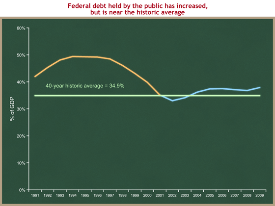
- no comparison to the historic average – It’s relevant to compare our federal debt [held by the public] with historic averages, to see if we’re in a lot of debt relative to where we’ve been in the past.
So here’s a new graph, using the same data source (OMB’s Historical Tables), which corrects for these three problems.
Now that we’re looking at a fair analytic presentation, we can draw a few conclusions from this new graph:
- Yes, the federal debt is higher than when the President took office. Debt in 2001 = 35.1% of GDP. Projected debt in 2009 = 37.9% of GDP.
- The claim that the debt is “almost doubling” under this President is absurd. Measured as a share of the economy, it’s about 8% higher than it was when the President took office. (37.9 – 35.1) / 35.1 = 8%
- This debt increase comes in the context of: an inherited recession, a stock market crash, corporate scandals, a terrorist attack, war, and a huge increase in the price of oil.
The President’s budget is merely the first stage in the annual Congressional budgeting process. The next step is for Chairman Conrad, and his House counterpart Chairman John Spratt (D-SC), to each propose his own budget. If their budgets raise taxes more than they increase spending, as was the case last year, then they would show lower debt held by the public than in the President’s budget. But since they so far have not tackled the Social Security challenge, we would still expect those budgets to show significant increases in Chairman Conrad’s preferred metric of “gross debt.”
I want to more fundamentally disagree with Chairman Conrad’s claim that “the debt is the threat.” (He has another chart that says this.) His statement focuses entirely on what has happened to the debt (using a misleading measure) over the past seven years. His focus is: (1) backward-looking, (2) short-term, and (3) focused on debt.
This is trivial compared to what we call “the real fiscal danger”: the projected long-run future growth of federal government spending.
- Where the Chairman’s focus is backward-looking, the real fiscal danger is in the future.
- Where the Chairman’s focus is on the past seven years, we face the real fiscal danger over the next several decades.
- The Chairman focuses on the debt. This is incomplete – our problem is debt driven by projected future spending growth.
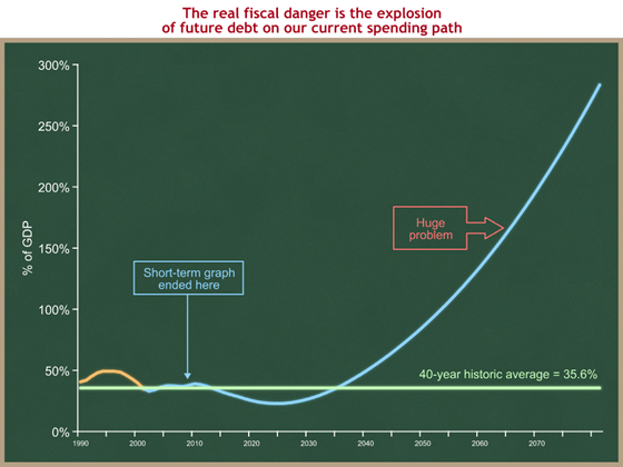
To make the first two of these points, let’s recreate the above graph, but I’m going to expand the timeline to cover the next several decade. Same graph, longer timeframe:
Now compare the part of this graph between 2000 and 2010, which is identical to the data in the graph above it, with what happens to the debt beginning in about 2025. On our current long-term policy path, the federal debt would explode beginning in about 20 years. Note that while this chart purports to go out to 2080, we would never make it that far on the light blue line on our current long-term policy path. Financial market pressures would force a change long before our federal debt got to 200 or 250% of GDP.
The real threat is not the additional 2.8% of GDP of debt we have accumulated since the President took office, during a time of recession, war, terrorist attacks, high oil prices, and burst stock market bubbles.
The real threat is that steady and steep upslope in the blue line – the explosion of future debt over the next several decades, if we don’t do something about it. The President has proposed to do something about it, and Congress has failed to act.


